How To Test A Design Concept For Effectiveness
Paul BoagMost of us are reasonably comfortable with the idea of carrying out usability testing on a website or prototype. We don’t always get the opportunity, but most people accept that it is a good idea.
However, when it comes to a design concept, opinion is more divided. Some designers feel it undermines their role, a view that seems to be somewhat backed up by the famous “Forty Shades of Blue” episode, where Google tested which one of forty shades of blue to use for link color.
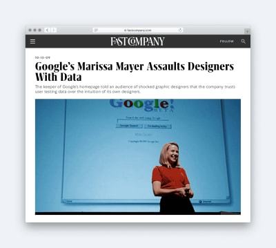
It is a position I can sympathize with, and testing certainly doesn’t tell us everything. For example, it cannot come up with the right solution, only judge a design that already exists. Neither is the kind of obsessional testing demonstrated by Google healthy for morale, or most companies bottom line.
That said, in this post, I want to explore some of the advantages testing design concepts can provide to us as designers, and demonstrate that we can do it cheaply and without slowing down the delivery of the overall project.
Let’s begin by asking why a designer might favor testing of their design concepts.
Why You Should Embrace Testing Design Concepts
Every designer has stories of being caught in revision hell. Endlessly tweaking colors and adjusting layout in the hopes of finally getting sign off from the client.
It’s not always like that, but every project is a gamble. Will the client, sign off immediately, or will you end up with a design concept named “Final-Version-21.sketch”? And that is the problem; you just do not know, which makes project planning and budgeting extremely difficult.
Testing Makes the Design Process Predictable
People tend to consider testing a design as a luxury that a project cannot afford. They see it as too time-consuming and expensive. However, in truth, it brings some much-needed predictability to a project that can, in many cases, make things quicker and cheaper.
Yes, if everything goes smoothly with design sign-off, design testing can slow things down and cost a little money. But, that rarely happens. Usually, a design goes through at least a few rounds of iteration, and occasionally it has to be thrown out entirely.
Rarely is this because the design is terrible. Instead, it is because stakeholders are unhappy with it.
By contrast, testing creates a framework for deciding whether a design is right, that is not based on personal preference. Some quick testing could approve a design without the need for further iteration or at worse would lead to some relatively minor amendments if the designer has done their job.
In most cases, this proves faster and less expensive than an endless discussion over the direction. However, even when it does not, it is more predictable, which improves product planning.
Testing also has another related advantage. It changes the basis upon which we assess the design.
Testing Encourages the Right Focus and Avoids Conflict
The design has a job to do. In most cases, it has to connect with a user emotionally, while also enabling them to use the website as efficiently as possible. Unfortunately, most design is not assessed on this basis.
Instead, we often evaluate a design on the simple criteria of whether or not the client likes it. It is this conflict between the role of a design and how it is evaluated that causes disagreements.
By carrying out testing on a design, you refocus the stakeholders on what matters because you build the test around those criteria instead.
That has another advantage as well. It helps avoid a lot of the disagreement over the design direction. That is especially true when many people are inputting on the design.
Because design is subjective, the more people who look at it, the more disagreement there will be. The way this is typically resolved is through a compromise that produces a design that pleases nobody and is often not fit for purpose.
Testing provides an alternative to that. It leads to less conflict between stakeholders and also ensures the integrity of the design, which ultimately leads to a better product.
Testing Improves Results
By using testing to avoid design by committee and focus stakeholders on the right assessment criteria, it almost guarantees a better design in the end.
However, there is another factor that ensures testing produces better design; that is the fact that we, as designers are not infallible.
Sometimes we misjudge the tone of the design or the mental model of the user. Sometimes we fail to spot how an image undermines the call to action or that the font is too small for an elderly audience. Testing helps us identify these issues early, while they are still easy to fix. Updating a mockup in Sketch or Figma is a lot easier than on a working website.
So hopefully now you see that design testing is a good idea for all parties concerned. The next question then becomes; how do we carry out design testing?
How to Implement Design Testing
Before you can test how well a design concept is working, you first need to be clear about what you are testing. Earlier I said that a design had two jobs. It had to connect with users emotionally and enable people to use the site as efficiently as possible.
With that in mind, we want to test two things:
- The brand and personality of the design, which is what dictates whether a design connects with the user emotionally.
- The usability and visual hierarchy, which enables people to use the site more efficiently.
It is important to note as well that for the sake of this article, I am presuming all we have is a static mockup of the design, with no interactivity.
So, let’s start by looking at how we test brand and personality.
Test Brand and Personality
Before somebody is willing to act on a website, they have to trust that website. Users have to form a positive first impression.
In a study published in the Journal of Behaviour and Information Technology, they found that the brain makes decisions in just a 20th of a second of viewing a webpage. What is more, these decisions have a lasting impact.
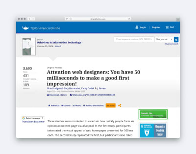
In that length of time, the user is judging the website purely on aesthetics, and so we need to ensure those aesthetics communicate the right things.
We have three ways we can test this, but let’s begin with my personal favorite.
Semantic Differential Survey
A semantic differential survey is a fancy name for a simple idea. Before you begin designing, first agree on a list of keywords that you want the design to signal to the end-user. These might be terms like trustworthy, fun or approachable.
Once you have created the design, you can now test whether it communicates these impressions in the user by running a semantic differential survey.
Simply show the user the design and ask them to rate the design against each of your keywords.
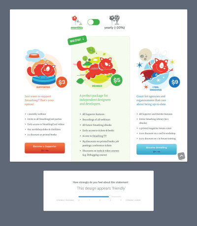
The great thing is that if the design rates well against all of the agreed words, not only do you know it is doing its job, it is also hard for stakeholders to reject the design because they don’t like some aspect of it.
You can use this method to ascertain the most effective approach from multiple designs. However, there is a much simpler test you can also adopt when you have more than one design concept.
Preference Tests
A preference test is what it sounds like. You simply show several design concepts to users and ask them to select which approach they prefer.
However, instead of just asking users to select which design they like most, ask them to select a design based on your keywords. You can ask users to select which design they feel best conveys the keywords you chose.
You can also apply the same principle of comparison to your competition.
Competition Testing
You can run precisely the same kind of preference test as above, but instead, compare your design concept against competitors’ websites. That will help you understand whether your design does a better job of communicating the desired keywords compared to the competition.
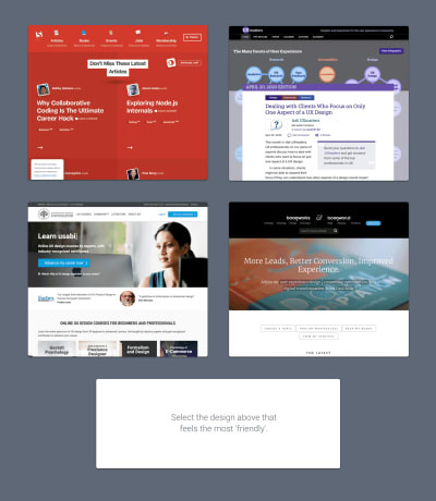
The advantage of both types of preference testing is that it discourages stakeholders from adopting a pick-and-mix approach to design. In other words, it encourages them to compare designs in their entirety, rather than selecting different design elements from the competition or different versions, and asking you to combine them into a Frankenstein approach.
By combining both semantic differential surveys and preference testing, you can build up a clear picture of whether a design’s aesthetics are communicating the right impression. However, we still need to ensure it is usable and that people can find the information or features they need.
Test Usability and Visual Hierarchy
A website can look great and give the user the right feel, but if it is hard to use it will have still failed to do its job.
Once you have a fully built website or even a prototype, testing for usability is easy by combining A/B testing (quantitive) with usability testing (qualitative).
However, when all you have is a static mockup of the design, it can appear harder to test. Fortunately, that impression is incorrect. What is more, it is worth testing at this early stage, because things will be much easier to fix.
We have two tests we can do to ascertain usability. The first focuses on navigation and the second on visual hierarchy.
First-Click Tests
An influential study into usability, by Bob Bailey and Cari Wolfson, demonstrated the importance of ensuring that the user makes an excellent first choice when navigating your website. They proved that if users got their first click right, they had an 87% chance of completing their task correctly; however, if they got it wrong that dropped to just 46%.
Fortunately, we can test whether users will make the right first click using an imaginatively named “first click test”.
In the first click, test users are given a task (e.g. “Where would you click to contact the website owners?”), and then they are shown the design concept.
The user then clicks the appropriate place on the concept that they believe is correct, and the results are recorded. It is that simple.
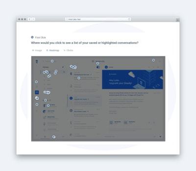
The advantage of running a first-click test from the designers perspective is that it can resolve disagreements about information architecture by demonstrating whether users understand labeling and the site’s overall structure.
However, usability isn’t all about clicking. It is also essential that users spot critical content and calls to action. To test for that, you need a 5-second test.
5-Second Tests
Research seems to indicate that on average, you have about 8 seconds to grab a users attention and that many leave a website within 10 to 20 seconds. That means our interfaces have to present information we want users to see in the most obvious way possible. Put another way; we need to distinguish between the most important and less important information.
Testing this kind of visual hierarchy can be achieved using a 5-second test.
Usability Hub describe a five-second test in this way:
“A five-second test is run by showing an image to a participant for just five seconds, after which the participant answers questions based on their memory and impression of the design.”
It is important to note not only whether users remembered seeing critical screen elements, but also how quickly they recalled those elements. If users mention less essential elements first, this might indicate they have too much prominence.
The great thing about a 5-second test is that it can reassure clients concerns that a user might overlook an interface element. Hopefully, that will reduce the number of “make my logo bigger” requests you receive.
As you can see, testing can help both improve your designs and make design sign off less painful. However, it may be that you have concerns about implementing these tests. Fortunately, it is more straightforward than you think.
Who and How to Test?
The good news is that there are some great tools out there to help you run the tests I have outlined in this post. In fact Usability Hub offers all five tests we have covered and more.
You simply create your test and then share the website address they give you with users.
Of course, finding those users can be challenging, so let’s talk about that.
When it comes to testing usability, we do not need many users. The Nielsen Norman Group suggests you only need to test with five people because beyond that you see diminishing returns.
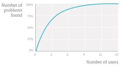
These users can be quickly recruited either from your existing customer base or via friends and family. However, if you want to be a bit pickier about your demographics, services like Usability Hub will recruit participants for as little as a dollar per person.
Testing aesthetics is trickier because as we have already established design is subjective. That means we need more people to remove any statistical anomalies.
Once again, the Nielsen Norman Group suggest a number. They say when you want statistically significant results, you should look for at least 20 people.
It is also worth noting that in the case of aesthetics, you should test with demographically accurate individuals, something that your testing platform should be able to help you recruit.
Although that will cost a small amount of money, it will be insignificant compared to the person-hours that would go into debating the best design approach.
There is also often a concern that it will take a long time. However, in my experience, you can typically get 20 responses in an hour or less. When was the last time you got design approval in under an hour?
Worth a Try
Testing a design concept will not solve all your designer woes. However, it will lead to better designs and has the potential to help with the management of stakeholders significantly. And when you consider the minimal investment in making it happen, it makes little sense not to try it on at least one project.

from Tumblr https://ift.tt/2XYAxv1
No comments:
Post a Comment