How To Design Powerful Narratives On Mobile
Suzanne ScaccaStories don’t always have to be told in a Once Upon a Time… format. Take a look at movies, for instance. Some stories are told in chronological order while others jump around a timeline. There are stories told from the perspective of the protagonist while others let viewers see the story from everyone’s point of view. Plus, stories can be sad, funny, dramatic or all of the above.
There’s a ton of variation in how a story can be told. There is one thing they all need to have in common though:
They need to somehow draw the reader into the narrative.
Storytelling is a very powerful tool for websites, but the same rules apply. It doesn’t matter how you tell the story — it just needs to draw the visitor in.
Today, I’m going to walk you through various storytelling techniques and give you some ideas for how you can design these kinds of narratives into your own mobile websites or PWAs.
How To Design Powerful Narratives On Mobile
Storytelling is a great tool for mobile websites.
One reason for that is because the smaller screen forces you to be more concise with the narrative. That means you can get visitors more quickly to the climax of your story, which will speed up their time to conversion.
Another reason why storytelling works so well on mobile is because it’s easier to suck visitors into the story. All you need to do is give your site a book-like feel and they’ll become quickly immersed in it.
What’s more, you can really let the visuals do most of the talking and cut down on the lengthy stories that company founders would otherwise want to tell about their companies.
There’s one industry, in particular, that I think does an exceptional job of storytelling in this manner, and that’s the beer and alcohol industry. If you think about it, these kinds of companies can’t afford to simply push their products in consumers’ faces. Here are some reasons why:
- “Let’s get you intoxicated” isn’t a very strong or unique selling point. But a story that draws the customer in and makes them part of the narrative can be.
- To prevent the analysis paralysis that comes with choosing one kind of liquor or beer from dozens of similar options, brands use stories to differentiate themselves.
- You can more effectively build long-term and loyal relationships with customers by turning your products into one-of-a-kind experiences.
Bottom line: When building sites for products or services in highly competitive spaces, storytelling can be a real game changer. As far as how you accomplish that through design, let’s look at some of the more common storytelling techniques and examples that show how they’re pulled off.
Aviation Gin
What kind of story does the site tell?
The Guided Journey
What kinds of businesses benefit from this kind of storytelling?
This kind of storytelling technique is best for new companies that have a strong branding component. That way, the company isn’t just another lookalike business entering the space. It’s offering something more entertaining and engaging that encourages prospective customers to hop along for the ride — even on Day 1.
The “mascot” is one of the best ways to make this kind of storytelling work because they become the visitors’ guide to exploring the site and all it has to offer.
Think about Flo from Progressive, William Shatner for Priceline or The Old Spice Guy. The second you see these mascots, you can’t help but wonder what kind of “adventure” they’re going to take you on next. It’s a fantastic way to build a loyal following.
What does The Guided Journey storytelling method look like?
In the case of Aviation Gin, co-owner Ryan Reynolds has not only lent his star power, but also the edgy sense of humor he’s well known for to the brand.
Upon entering the mobile site, Reynolds’ face is the first thing visitors see:
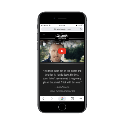
The video (and the ridiculous quote beneath it) is what you’d expect from Reynolds, cracking jokes while introducing visitors to an absurd world he probably made up on the spot. It’s also short, to the point and will undoubtedly leave visitors thinking:
Okay, okay, I gotta give this gin a try.
Scroll down once, and you’ll find this invitation to connect with Reynolds through the Aviation Gin newsletter:
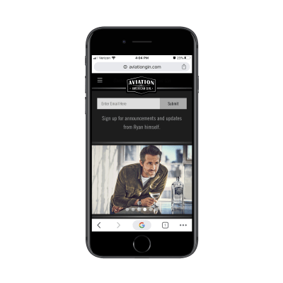
Although it cuts back a bit on Reynolds’ humor, it continues to portray him as the pilot of this journey visitors are about to take. And if we know anything about what our users want, that’s a brilliant move. Reynolds isn’t just dangled in front of them with the occasional ad (like so many companies do with their spokespeople). He’s actually built into the experience.
What’s more, Aviation Gin has constructed the rest of the website to play out like a flight, with crafty plays on words and relevant graphics.

This one-page website is done so well from start to finish, and a huge part of that is due to the story they’ve committed to:
- We are Aviation Gin.
- Ryan Reynolds will be taking you to your destination.
- Don’t you want to come along for the ride?
It’s a great narrative. And for those who don’t know who Ryan Reynolds is, the buttoned-up website with its flight analogies and wordplay should be enough to draw them in, too.
Pacto-Navio
What kind of story does the site tell?
The Immersive Tale
What kinds of businesses benefit from this kind of storytelling?
This is another effective approach to storytelling if you’re building a site for a new business. In this case, though, there isn’t a real-life persona who can take them along on the brand’s journey. Instead, you have to rely on the strength of the brand and your ability to design something that feels immersive.
This is going to be especially useful if the company hasn’t been around for a long time and you don’t have much history or accolades to draw upon. Just make sure you have a clear focus for your tale, so visitors don’t try to wander off the path you’ve created for them.
What does The Immersive Tale storytelling method look like?
To build an immersive tale on a mobile website, you have to frame it as an adventure. That way, visitors aren’t even thinking about the menu button. Instead, they’re ready to play along and let you take them through the site.
Pacto-Navio handles this kind of storytelling well. There are a number of reasons why this works, too.
First, each part of the story has a dedicated full page:
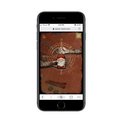
This, for instance, is the home page. At first, all visitors see is the compass, but then the two hands move in from the east (France) and the west (Cuba) to symbolize the two countries where the rum comes from.
This is another reason why this site feels so immersive. From the very beginning, the website actively moves visitors from the point of entry to their destination. And I mean this literally.
The site is full of animations. They’re not overwhelming or unnecessary. Each of the moving elements (even the transitions between horizontal page flips) is subtle yet relevant.
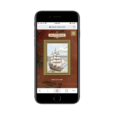
The design of the site as a whole should make visitors feel like they’re reading some epic tale of adventure. But this is a website; not some book that’s confined to telling a story on the pages.
The Pacto-Navio mobile site allows visitors to decide when they want to stop and explore some more. And when they do, more of the story is revealed:
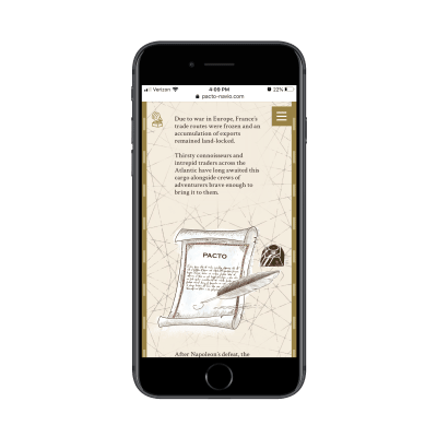
In a sense, this style of website — where each page is represented by a single card and they can be flipped through like the pages of a book — is one of the most engaging ways to tell a story.
Each page and corresponding graphic is served up one at a time. Then, when visitors choose to explore more, the story is briefly recounted while small animations keep them focused on moving down the page. It really does feel like you’re reading a book.
Samuel Adams
What kind of story does the site tell?
The Love Letter
What kinds of businesses benefit from this kind of storytelling?
If you’ve ever read a book or watched a movie where the physical location (usually a city) has a role to play in the story, then you know how emotional of an experience it can become.
Take any of Woody Allen’s movies, for instance. Many of them are set in New York City or in lush cities around Europe — and it feels as though the cities themselves are characters. The same goes for books. Stephen King does this a lot, like with the Overlook Hotel in The Shining or Shawshank Prison in The Shawshank Redemption. The places play just as important a role as the people in the stories.
Believe it or not, this is something you can do with your mobile site if it’s for a business with strong ties to a geographic area.
What does The Love Letter storytelling method look like?
Samuel Adams is a brewery with deep ties to Boston, Massachusetts.
People from Boston have a tendency to be fiercely loyal champions for local brands and businesses — and the relationship they have with this brewery is no different. That’s why it’s no surprise that Samuel Adams’ website is dedicated to:
- The city of Boston,
- The people of Boston.
Think of it as a love letter to all things Boston.
The mobile site starts with the following:
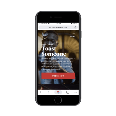
There’s no mention of Samuel Adams’ beer in this hero image. This is a call-to-action: Toast Someone.
This video shows comedians toasting the people who changed their lives and empowered them to do what they do. It’s a really heartfelt way to start people on their journey with Samuel Adams.
A little way down the page, the brewery explains why it’s had comedians make these toasts in the first place:
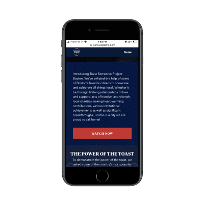
But it’s not just famous people that the brand has asked to participate in its collective toast. The next video is an ode to the city of Boston and its residents.
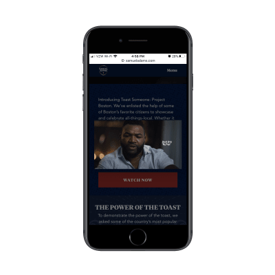
Visitors see famous Boston residents (like Big Papi of the Boston Red Sox give their love and respect to the city), but it’s not just big-name figures who speak out in the video:
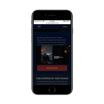
In addition to seeing beautiful shots of the city of Boston, you can see the real people of the city. In the screengrab above is one of the survivors of the Boston Marathon bombing. But you can also see a team of rowers heading onto the Charles River, a barbershop and people boxing in a gym.
Sure, Sam Adams’ beer bottles can be seen in the toasts people give, but it’s still a touching video and a beautiful ode to the city of Boston. And because this site is completely separate from the Samuel Adams store, it helps keep people’s focus on the toast project and the positive sentiment coming from it.
Wintrip Brew Co.
What kind of story does the site tell?
The Graphic Novel
What kinds of businesses benefit from this kind of storytelling?
There are tons of examples of graphic novels and comic books that have later become hit movies or TV shows:
- The Walking Dead
- Watchmen
- Sin City
- V for Vendetta
- Ghost in the Shell
Truth be told, this style of storytelling won’t work for most brands because it requires a brand to be edgy, dark or boundary-pushing for it to work. It also needs a brand to be 100% focused on its product. That doesn’t mean it can’t have an original or inspiring story of its own to tell, but the pacing of a story like this should really stay focused on what you’re selling.
“
What does The Graphic Novel storytelling method look like?
There’s no one way to design websites using this storytelling method. That’s because there’s so much variation in the way graphic novels and comic books are designed. Batman, for instance, is dark and moody. Watchmen is all about the exaggerated, retro design. And, then, there’s The Walking Dead that just feels grimy.
You have to decide what kind of “edge” you want to give your site. But one thing is for certain: it needs to have a striking contrast between dark and light.
This is the mobile site for Wintrip Brew Co.:
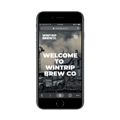
If you didn’t know any better, you might think this was a site for a graphic novel or even a video game.
But this is indeed the way Wintrip Brew Co. welcomes its visitors — and it’s a great first impression to make. After all, who the heck would go to the trouble of designing a home page to look like a graphic novel if the rest of the site weren’t going to follow suit?
There’s no reason why visitors wouldn’t want to keep stumbling along this path.
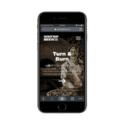
Every inch of this site feels like a graphic novel. There are odd characters scattered throughout it, inviting visitors to explore more of each page (like the zombie-eyed chef above).
Then, there’s the actual story told on the pages:
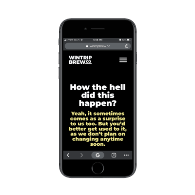
The typography is kept simple and yet the striking color contrast gives it an edge. If visitors don’t pick up on the subtle cues the font design gives off, then the words that are chock full of attitude certainly will.
While I’d love to show you how the “Beer” page is designed, the words on it are incredibly risque. Suffice to say, what you see above is the tip of the iceberg in terms of boundary-pushing.
But that’s okay because that’s what this brand is all about. It’s evident even in the way they’ve brewed their beers that they want to appeal to beer drinkers who are looking for something darker and more cutting-edge. And the design of this website has set the perfect tone for that.
Yuengling
What kind of story does the site tell?
The Timeline
What kinds of businesses benefit from this kind of storytelling?
The Timeline is best used by brands that have lengthy histories. These are the companies that have been in operation for over 100 years. It would also apply to businesses that have dozens of milestones they’ve racked up over the years.
You might not get many of these that pass your way, but when you do, The Timeline is a beautiful way to tell a company’s (and their loyal patrons’) story.
As for why you’d opt for this method of storytelling, it’s one of the more efficient ways to do so. Otherwise, you’d end up with insanely long pages trying to recap everything a brand has accomplished over the years — and that would be a waste of your time trying to design something like that and a major test of your visitors’ patience.
Instead, a timeline chops up a story into small, digestible and still very impressive pieces.
What does The Timeline storytelling method look like?
This one is obvious. You’re going to start with the very beginning of the brand’s story (usually how the founders met or came up with their idea) and end with today. Along the way, you’re going to share a few words and some eye-catching imagery to highlight the milestones.
Let’s look at the example of Yuengling, which is the oldest brewery in the United States. The company’s timeline begins with a single introductory paragraph and video:
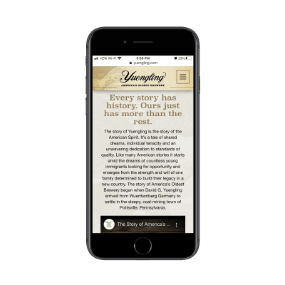
Visitors who want to take time to get this introduction can do so with ease. The rest can skip down to the timeline that starts with the company’s founding in 1829.
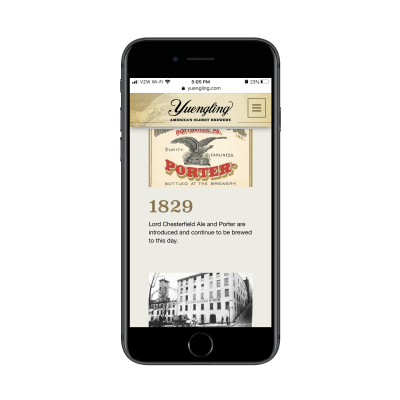
What’s always nice about a company’s timeline is being able to see how consistent it’s been from the very beginning. Even if a company has changed hands or undergone name changes, many times the design of its branding or the product itself remains unchanged.
You can see a hint of that above with the Porter design, which isn’t unlike the current design of some of Yuengling’s packaging.
As the story goes on, visitors get to learn more about the company — its wins, its losses, and the changes it’s made for the sake of its customers.
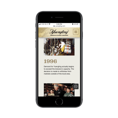
That’s ultimately what the goal should be in designing a brand’s story in a timeline. It shouldn’t be so you can display award after award received. If you want to keep visitors engaged and turn them into customers in the end, then you have to show them how they factor into the story.
In the screenshot above, 1996’s summary says:
Demand for Yuengling actually begins to exceed the brewery’s capacity. The decision is made to withdraw from markets outside of the local area.
This is exactly the kind of thing customers want to see when they’re looking for brands to stay loyal to. This demonstrates the brand’s loyalty to providing customers with a high-quality product instead of on getting rich (which it could’ve easily done).
Wrapping Up
As you can see, there are tons of ways to tell a story through design. And while the websites above look fine when viewed on larger screens, where they really shine is mobile. That’s because designers are able to craft experiences that feel more like you’re turning the pages of a book instead of being asked to scroll through endless amounts of text on the web.
The above list is by no means exhaustive as you can tell stories in all kinds of ways for businesses. Just listen to what your clients have to say about their companies and then create a journey that matches the one they took (or the detour they’re on today).
Related Article on SmashingMag
Users have many expectations when they come to your site. Placing your users in the context of a story helps you understand those expectations and their motivations. You’ll see what they want and expect, but also what they need. Once you know their needs, you can meet those needs. Learn more from an article written by John Rhea →

from Tumblr https://ift.tt/2t0mycu
No comments:
Post a Comment