5 Things To Stop Doing In Mobile App Design
Suzanne ScaccaI move to a new state every two to three years, so it’s important for me to live “light”. Every time I prepare to move, I go through the “Do I really need to keep this?” exercise. Although I’ve been doing this for almost 20 years, it never gets any easier. I wonder things like:
What if I sell my bed and never have a comfortable night’s sleep again?
What if I get rid of the fancy dress I wore once but might need for some hypothetical future event?
What if I decide to start baking cupcakes again and don’t have my cupcake tin anymore?
It’s easy to get attached to things when they served you well at one time or another. But if you take a closer look at the “stuff” you’ve accumulated, you’ll realize that a lot of it has lost its usefulness along the way.
I think it’s important to run through a similar type of decluttering exercise in the work you do as a designer. That way, the apps you build always look fresh and modern instead of weighed down by antiquated features or functionality that at one time had a purpose.
Before you start charging ahead into the new year, take a moment to reflect on how you approach mobile app design. If you’re still holding onto components or functionality that no longer serve any purpose or, worse, intrude on the user experience, it’s time for a change.
Want some help? I’m going to run through some elements you can afford to scrap from mobile app builds in 2020 and beyond.
Related Reading on SmashingMag:
- Bottom Navigation Pattern On Mobile Web Pages: A Better Alternative?
- Learning Framer By Creating A Mobile App Prototype
- iOS Performance Tricks To Make Your App Feel More Performant
- How To Design Search For Your Mobile App
1. Harmful FOMO Elements
You know why marketers, influencers, and designers use FOMO (i.e. it can be really effective in boosting sales). However, you also know how damaging it can be for users’ mindsets (not to mention the distrust they feel towards brands as a result).
You could avoid FOMO altogether, but it’s a tricky thing, isn’t it?
You know that (when left to their own devices) mobile app users may forget that your app even exists on their phones without something to pull them back in. But it’s too easy to go overboard with FOMO-inducing components.
For example, this is ToonBlast:
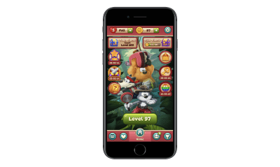
The home screen is incredibly overwhelming. More than that, those ticking clocks (there are four of them) are a nightmare for users who can’t help but click on things they feel they’re going to miss out on by not doing so. And for users who can ignore the timers, they won’t be completely unaffected by them either. The game displays pop-up reminders for each of the countdowns. It’s impossible to ignore them.
This is FOMO at its absolute worst.
Even if reminders for each of the countdowns were sent as push notifications instead of disruptive pop-ups, it still would be bad for the user experience. There are just too many things competing for the user’s attention and each of the clocks is like a ticking time bomb.
I know it might seem like giving app users more reasons to engage is a good idea, especially if you’re struggling to attract and retain users. But if that’s really an issue, then you need to work on improving the core product first and foremost.
Going forward, I think we’d all do well to move away from harmful FOMO elements and embrace more simplified and stronger core products.
If you’re not sure what that looks like, I’d recommend turning your attention to Instagram:
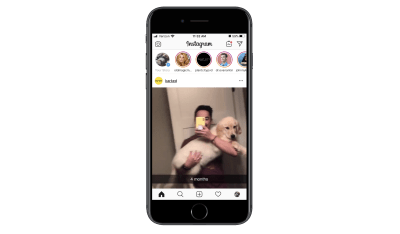
Instagram is a simple and straightforward product. Users turn their news feeds into personal curations of people and accounts they want to follow while sharing their own content with the world.
Now, Instagram isn’t completely FOMO-free as you can see from the Stories bar at the top of the page. However, there’s nothing really urgent about the way these stories are displayed. They don’t take up much space in the app (unlike the way Facebook handles it, for instance) nor are there any screaming alarms that say, “Hey! So-and-so’s story is about to expire! Watch it now!”
That said, Instagram is working to remove the harmful effects of FOMO in its app by doing away with like counters and cracking down on influencers and companies that don’t mark ads as such. If you want to create a strong yet simple product that keeps harmful FOMO elements out of the picture, keep this one on your radar.
2. Out-of-Context Access Requests
Unlike mobile websites and PWAs, mobile apps have the ability to get in front of 100% of users who activate push notifications. But that’s the catch. Your users have to be willing to press “OK” or “Allow” when you display that push notification (or phone access) request pop-up.
So, how do you get more of them to do that without constantly shoving those requests down their throats?
Some brands haven’t figured this out yet, to be honest. Take Snapchat, for example.
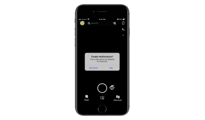
This is one of those apps that just goes way overboard when it comes to requesting access to users’ devices. It wants to:
- Send push notifications.
- Use the camera.
- Use the microphone.
- Access saved photos.
- Enable location tracking.
- And so on.
Rather than ask for access when it’s relevant, it often sends a deluge of requests first thing when users sign into the app. That’s the wrong way to create a welcoming environment for your users.
A better way to go about asking for access or permissions would be to place it in the context of the app — and only when it makes sense. I’ll show you a couple of examples.
This is the app for ParkWhiz:
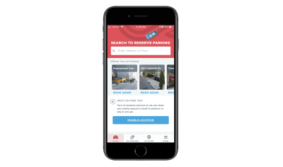
Look at the section called “Help Us Find You” toward the bottom.
Not only does ParkWhiz gently remind users to enable location tracking on their devices, but it does so by explaining the reasons why it would benefit them to do so. Notice also that this isn’t displayed in an intrusive pop-up at the point of entry. Instead, it’s in a spot in the app where, when enabled, it can help streamline the search experience.
YouTube is another app that does this well.
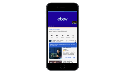
In this example, YouTube quickly displays a tooltip over the disabled notification icon. The notice reads:
“You’re missing out on subscriptions! Tap the bell to turn on notifications.”
They’re right. I’m subscribed to this channel and, yet, I haven’t received notifications (push or email) about new videos for a while. I hadn’t realized this until I saw this reminder.
The way this is handled is nice. It makes users stop and think about what they’re missing out on instead of rushing to close out another request pop-up. It also doesn’t force them to turn on push for everything. They can customize which notifications they receive.
Push notifications are supposed to be helpful. And access to your users’ phones is supposed to enhance their experience. That’s why it’s important to ask for their cooperation in enabling these features within the right context. Rather than bombard them with request after request at the outset of installing or opening an app, deliver them within the experience as in-line elements.
3. Unnecessary Icon Labels
Note that this point is called unnecessary icon labels and not just a sweeping generalization of all of them. That’s because there are certain parts of an app where icon labels still work well. Like the navigation bar.
However, I’ve noticed an alarming trend lately whereby apps pair every page or tab name with a matching icon. There are a number of reasons why this is an issue and I’m going to use the GEICO app to demonstrate them.
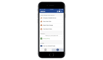
This home page makes it easy for users to take advantage of their auto insurance and related services on the go. Let’s focus on the “Vehicle Trouble” section though.
There are four tabs:
- Emergency Roadside Service represented by a tow truck icon,
- Start a New Claim represented by a car with what looks like a crash symbol,
- Report Glass Damage represented by a car with a crack on the windshield,
- View Recent Claims represented by a clipboard with the letter “C” on it.
The icons aren’t all that easy to decipher (except the tow truck) and I’m just not sure they add any value here. Really, if you can’t think of anything better than putting a letter “C” on a clipboard to represent claims, maybe icons aren’t needed after all?
Next, let’s take a look at the GEICO app’s list of settings:

There are a lot of settings pages here. Not only that, they’re not the kinds of pages you’d typically see in other mobile apps, so the designer has had to get creative in pairing them with icons.
If this navigation didn’t have icons, I think it would be much easier to read through the options. The same goes for the home page. Without the icons, the font size could be increased so the focus could strictly be on the page names and insured users could get to the information they need more quickly. As it stands now, the icons are just wasted space.
Let’s look at another example.
Rover is an app that pet owners can use to book pet sitting and walking services. Icons are used sparingly through the app to distinguish services from one another as well as to label the navigation pages.

I don’t think the icons on this page are necessary in terms of expediting user selection (e.g. “I need overnight house sitting so I’m going to choose the moon-over-the-house icon.”). That said, I don’t think the icons detract from the button text since each option is clearly labeled with big, bold font. What’s more, the icons do a nice job of bringing balance to the buttons so there aren’t huge white gaps in the middle.
Now, let’s look at what the designer has chosen to do under the “More” tab:
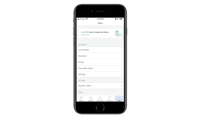
This is similar to GEICO’s slide-out navigation menu. But notice how Rover’s is text only. Considering how common these settings are from app to app, it would’ve been easy enough to add icons to each, but the designer chose to leave them off and I think that was a good decision.
There’s a time and place when icons serve a purpose. As far as labeling a secondary navigation menu in your app, it’s time to do away with that. I’d also express caution over labeling pages with icons if it’s a struggle to find a match. That should be a sign to you that they’re not needed to begin with.
4. Excessively Long Home Pages
In web design, we’re seeing much shorter home pages than in years past, thanks to the need for more efficient mobile experiences. So, why isn’t this something we’re doing in mobile app design?
There are some apps where this isn’t an issue. Namely, ones where there’s no scrolling at all (e.g. dating apps, gaming apps, etc.). And there are some cases where endless scrolling on the home page is fine (e.g. news and social media apps).
But what about other apps?
Listings apps (like for real estate or travel) sometimes have a hard time with this. For example, this is the top of the Airbnb mobile app:
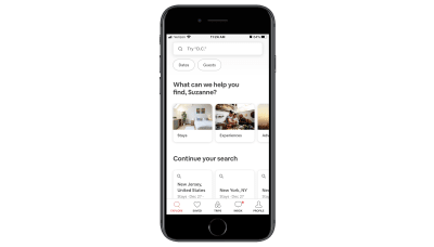
This part of the page is well done and includes everything users need to find what they’re looking for:
- A search bar,
- A list of travel categories to swipe through,
- Quick links to recent search queries.
But for some reason, Airbnb has designed this home page to go on and on and on with sections for:
- Top-rated experiences,
- Airbnb Plus places to stay,
- Introducing Airbnb Adventures,
- Places to stay around the world,
- Featured Airbnb Plus destinations,
- Stay with a superhost,
- Unique places to stay for your next trip,
- Explore New York City,
- And on and on it goes.
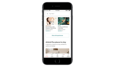
I’m not sure what the logic was here. While I understand wanting to help your users by providing them with useful recommendations, this goes way overboard. It’s not even as though this is personalized content based on the user’s profile or recent searches. It’s just a smattering of categories that, if anything, are going to overload and overwhelm users with options.
If the app you’re building or have built runs into a similar problem, check out Hotels.com for inspiration:
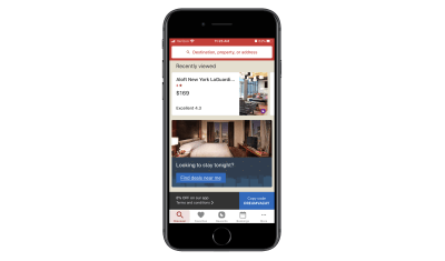
Unlike Airbnb, Hotels.com’s home “Discover” page is short. All it takes is three swipes to get to the bottom of the page. Users see sections for:
- Recent searches,
- A city guide (based on a recent query),
- Last-minute deals,
- Current bookings,
- Hotels.com Rewards standings (if relevant).
For the most part, the content is 100% relevant to the user and not just meant to promote every possible service or feature of the app.
If you really feel like users would benefit from seeing every possible feature, create a secondary navigation for it. That way, they can quickly scan through the options and pick the one(s) they’re most interested in. When you give them an endless home page to scroll through and too many listings and buttons to click, you’re only going to make it harder for them to take action.
5. Dark Patterns in Ads
You have to monetize a mobile app if you’re going to make the original investment worth your while. It’s as simple as that.
But I’ve recently encountered some very scary dark patterns in mobile app monetization — specifically, with the way ads are designed. And it’s got me wondering if third-party ad networks are really the smartest way to monetize if they’re going to compromise everything you’ve done to create an awesome in-app experience otherwise.
Now, I understand that app designers usually don’t have any role in designing the ads that appear. That said, do you really think your users know anything about ad networks and how those ad placements get inside your app? Of course not!
So, when one of your users has a bad experience with an ad, what do you think is going to happen? They’re not going to think:
“Oh, that advertiser is terrible for doing that.”
Instead, they’re going to think:
“If I see one more ad like this, I’m uninstalling this app.”
Let me show you some examples of ads that will push the limits of your users’ patience.
This is Wordscapes, a gaming app I’m quite fond of:
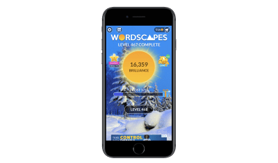
I’ve been playing Wordscapes for a long time and when I first started, it was great. The banner ads were there, but they never really got in the way. And the interstitial video ads only appeared every few rounds or so. They were always easy to dismiss, too.
Over the past year or so, however, the quality of ads has majorly deteriorated. Take the banner ad above. That’s actually a video ad that doesn’t fit in the allotted space.
Then, you have this badly designed banner ad for Jynarque:
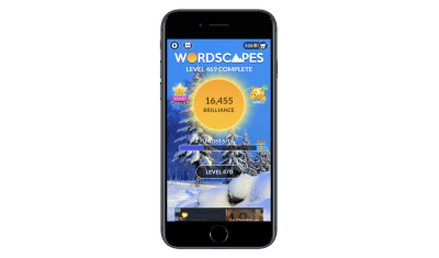
Neither of these banner ads are really dark patterns. However, they do suggest there’s something not quite right about where Wordscapes is sourcing their ad content from.
Now, I’m going to show you some of the more deceptive ads I’ve come across.
This is an ad from Showtime to promote the TV show Shameless:
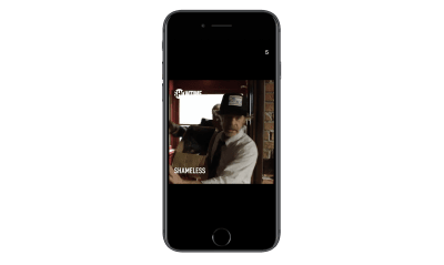
See the number “5” in the top-right corner? That’s a countdown timer, which should tell users how long they have to wait until they can dismiss the ad. However, when the timer is up, this icon appears:
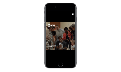
The timer gets to “0” and is replaced by this button. It’s not the traditional “X” that app users are accustomed to when it comes to watching ads, so they might not realize this will take them back into the game. In fact, they might misinterpret this “Next” symbol as a “Play” button and watch the ad in full. While it’s nice that Showtime gives users an exit, it would be better if the iconography were consistent with other video ads.
Then, there’s this interstitial ad for DoorDash:
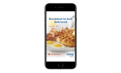
This is what the ad looks like the second it appears on the screen, which is actually encouraging.
“An ad that’s going to let us exit out of it right away! Woohoo!”
But that’s not the case at all. Notice how there are two X’s in the top-right corner. One of them looks fake (the plain “X” symbol) while the other looks like an “X” you’d use to dismiss an ad.
The first time I saw this, I clicked on the good “X”, hoping my finger would be small enough to miss the fake target. Yet, this is where I ended up:
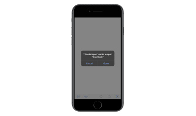
The click takes users out of the Wordscapes app and tries to move them to the app store. After hitting “Cancel” and sitting through five more seconds of the DoorDash ad, this new “X” appears in the top-right corner:
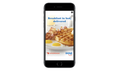
At this point, I can’t imagine users are very happy with DoorDash or Wordscapes for this experience.
These examples of bad ads and dark patterns in monetization are just the tip of the iceberg, too. There are ads that:
- Provide no timer or indication of when the ad will end.
- Switch the placement of the “X” so users unintentionally click the ad instead of leave it.
- Auto-play sound even when the device’s sound is turned off.
I know I’m picking on Wordscapes because I spend the most time inside the app, but it’s not the only one whose reputation is being hurt by third-party ad content.
Again, I recognize that you have no say in the design or execution of ads that come from ad networks. That said, I’d really urge you to talk to your clients about being more discerning about where they source their ads from. If mobile ads continue to be this bad, it might be worth sourcing your own ad content from partners and sponsors you trust instead of random companies that use deceptive advertising tactics.
Wrapping Up
There are a ton of reasons to declutter your mobile app designs. But if these examples have demonstrated anything, the most important reason to clean up is to get rid of useless and sometimes harmful design elements or techniques.
And if you’re having a hard time getting rid of the excess, I’d encourage you to reevaluate the core product. If it’s not strong enough to stand on its own, in its simplest of forms, then it’s time to go back to the drawing board because no amount of distractions you fill it with will make it a worthwhile download for your users.
 (ra, il)
from Tumblr https://ift.tt/39pxuAR
No comments:
Post a Comment