Forms are one of the most basic primary interactions users will have with your websites (and mobile apps). They link people together and let them communicate. They let them comment on articles and explain to the author how they strongly disagree with what they’ve written. They let people chat directly on a dating app to meet “the one”. Whether for forums, product orders, online communities, account creation or online payment, forms are a big part of users’ online life.
It’s 2018, and we have more mobile than desktop users around the globe. Yet, we still treat those users as second-class citizens of the web. Everybody writes and speaks about user experience all the time. So, why, why, why are so many websites and products still doing it wrong. Why is their mobile user experience damaged for half of the world? Why is it still a pain, why is it still super-hard to book a flight and register an account in a mobile form today? Users expect better!
Recommended reading: World Wide Web, Not Wealthy Western Web
This is the first part of a series of two articles. In this one, I will sum up some essential best practices to improve your mobile forms, including scannability and readability. I will guide you through label and input placement, size and optimization. We will see how to choose the right form element to reduce interaction costs. Finally, you will learn how to prevent and deal with errors on mobile forms.
In the second part, I will take a closer look at specific mobile capabilities and HTML5 form elements, and we will go beyond classic form elements to make unique and enjoyable web applications and websites.
Note: While most of the code enhancement in this article are web-related (because I don’t know Swift or Java), the usability best practices hold true for mobile applications.
Nope, we can’t do any magic tricks, but we have articles, books and webinars featuring techniques we all can use to improve our work. Smashing Members get a seasoned selection of magic front-end tricks — e.g. live designing sessions and perf audits, too. Just sayin’! ;-)
Explore Smashing Wizardry → Form Design 101: Prioritizing Scannability And Readability
“A form is the name, value, pairs, in a structure for storing data on a computer barfed out as labels and input fields to human being.” This is a direct quote from Luke Wroblewski at a conference. Like him, I believe that most form usability issues come from this tendency to serve the structure of the database to users.
Strong Information ArchitectureTo build better forms, you first need to take a few steps away from your database’s structure. Try to understand how users want to fill in forms. This is where doing some usability testing and user research on your forms becomes handy. User mental models is a UX concept that can help you with that. Nielsen Norman Group describes it as “what the user believes about the system at hand”. Ask your tester to think aloud and tell you how they would fill the form. Which steps do they expect? What come first? What comes next? This will give you a better idea of how to structure your form in a more user-friendly way.
Visually grouping fields that belong together will also help users fill a form. In the code, use the fieldset tag to group them programmatically. It will also help screen readers understand the hierarchy.
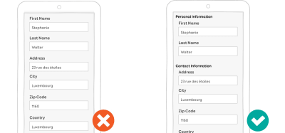 Chunking information and grouping related pieces of information helps the human brain process this information in an easy, more readable way (Large preview)
If the form is long, don’t expose everything by default. Be smart about what you display. Use branching wisely to display only the fields that people need. In a checkout form, for example, don’t display all of the detailed fields for all of the shipment options. This will overwhelm the user. Display enough information to help them choose the right shipment option. Then, display only the details and fields related to that choice.
User attention spans get shorter with time: Ask for optional things at the end of the form. For instance, if your form is a customer-satisfaction survey, ask for demographic information at the end. Better yet, auto-fill them, if possible. Ask users only for what’s necessary.
Finally, plan ahead for localization: What will happen when your form gets translated? What will happen, say, for German? Will your design still work?
Label Placement And Input Optimization Single-Column Layout Works BestDue to the lack of space, you don’t get endless options for placing labels and fields on mobile screens:
- Present fields in a single-column layout. There’s no room on mobile for multiple columns. Multi-columns forms are not a great idea on desktop either anyway.
- In portrait mode, it’s better to place the label on top of the field so that users can see what’s in the field when they type.
 In portrait mode, it’s better to put the label on top of the field. (Large preview)
- In landscape mode, the screen’s height is reduced. You might want to put labels on the left and inputs on the right. But test it to make sure it works.
 In landscape mode, you want to put labels on the left and inputs on the right. (Large preview)
For more on label placement, see Baymard Institute’s “Mobile Form Usability: Place Labels Above the Field”.
Labels Should Be Clear And Visible And Work Without ContextRemember that as soon as a field gets focus, the keyboard opens and will take at least one third of the screen’s area. On small mobile screens, users will also have to scroll to fill the form. This means that they will lose part of the context while filling the form. Plan accordingly:
- Your labels should be clear, visible text that can be read and understood without context. User should be able to complete each label and field pair as a separate task, even if they lose context.
 Just “Address” without context is more complicated to process that “Shipping Address”. (Large preview)
- Avoid jargon, abbreviations and industry-specific language whenever you can.
- Be consistent. If you use “customer” in a label once, stick with that word. Avoid using “clients” later because it might confuse users.
- The font size should be big enough. Test your form on real devices as soon as possible, and adjust the size accordingly.
- All-caps text can be hard to read for some users. You might want to avoid using all-caps text on labels.
- The label copy should be short and scannable. If a field needs clarification, don’t put it in the label. Use a field description instead.
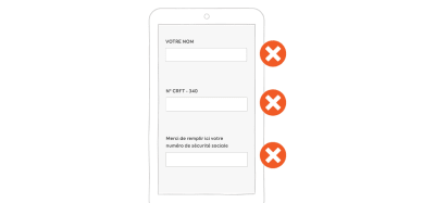 Avoid full caps, jargon and very long labels. (Large preview) Input Size Best Practice
If possible, the size of the input element should match the size of the expected content. This will help users quickly fill in the form and understand what’s expected.
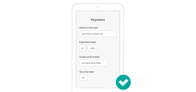 Properly sized inputs help the user scan the form and understand what is expected in the fields. (Large preview) Using Masks To Avoid Splitting Inputs On Mobile
Don’t split inputs just for the sake of formatting. It’s especially annoying on mobile, where users can’t use the keyboard to navigate between fields. It requires extra taps just to go to the next field to fill in the form. You might be thinking, “But I’ll automagically put the focus on the next field when I get the required number of characters in that field”. That could work. But you will have taken control of the UI, which becomes unpredictable for the user. Also, it would be a pain if you automagically sent them to the next field and they needed to correct something in the last field. Finally, it’s more complicated to guess what’s mandatory with split inputs. So, let’s stop playing the “But what if” game and simply not split inputs.
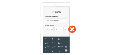 Don’t split the phone number into many little inputs. (Large preview)
I get it: You still want to be able to format your user’s data in small pieces to help them fill in your fields. And you are perfectly right about that. To do so, you could use masks. Instead of splitting an input, just put a mask on top of it, to visually help the user fill it. Here is a video example of what a mask would look like to help users fill in a credit-card field:
Masks help to prevent errors by guiding users to the correct format. Avoid gradually revealing them — show the format directly. Also, avoid putting fake values in the mask. Users might think it’s already filled. That’s why I’ve replaced the numbers with a little “X” in my demo. Find what works best for your type of input.
Finally, remember that some data can vary between countries, and sometimes the format changes, too (phone numbers, for example). Plan accordingly.
Efficient Fields DescriptionsDisplaying efficient field descriptions can make the difference between a seamless and a painful form experience.
What Can Descriptions Be Used For?Descriptions can help users in so many ways. Here are a few examples.
- What Exactly Are You Asking For?
For whatever database-related reason, some shipment companies ask for “Address 1” and “Address 2” fields. This is highly confusing for users, but you might not have a choice here. Add description fields to help users understand what they need to put in each field.
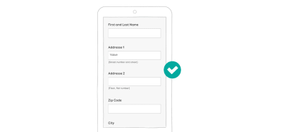 Inline descriptions help users understand why you need this information. (Large preview)
The same goes for acronyms and abbreviations. I know I said that you should avoid them, but sometimes you can’t. If you work on complex forms for a particular industry, for instance, they might have their own set of abbreviations. Any new user who needs to fill in the form might not be familiar (yet) with those abbreviations. Having a description available somewhere will help them.
- Why Do You This Information?
Users might be reluctant to give you personal information if they don’t understand why you need it and what you will do with it. But sometimes you still need to ask for such information for legal reasons (like date of birth for a website that sells alcohol). Using field descriptions here will help users understand why this kind of information is needed.
On e-commerce websites, you might want to ask for the user’s phone number in case the delivery person needs to contact them. This is a legitimate reason. So, again, use descriptions to explain to e-commerce users why you need their phone number.
 Sometimes you need information for legal or practical reasons. Again, tell the user why. (Large preview)
 - “Where Do I Find the Information?”
If your users need to find certain information somewhere else in order to fill a form, tell them where to find it. I worked on a mobile app that lets user track their house. Users needed to pair the app to the monitoring device using a serial number. It’s not very easy to find this serial number on the device; it requires some instruction. We added a little ? button next to the serial number field. The button opens a modal that shows a picture and some indication to help the user understand where to find the serial number on the monitoring device. E-commerce websites do the same with promo codes: They give indicators that tell users where to find the codes.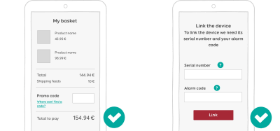 Users can tap on the link (left) or the question mark (right) to open a popup where they can find extra information to help them fill in the field. (Large preview)
 - “How Should I Format The Information?”
Some fields need a particular format. In this case, use descriptions to let users know the formatting rules up front. Here are a few examples:- Phone number: do I need to put the international dialing code (+xx) in front of the field?
- Is there a maximum length? Twitter on mobile does a good job with that one.
- When dealing with monetary amounts, is the format with comma (like 10,000) or a space (like 10 000)?
- What format do you expect for dates? I’ll let you check on Wikipedia what a nightmare that is. The difference between DD MM YY and MM DD YY can cause a *lot* of trouble to users when booking online.
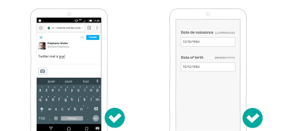 In the old 180-character days, Twitter used to tell you exactly how many characters you had left. Also, the date format varies from one country to another, so you might want to explain what to expect. (Large preview)
In the examples, above, we saw a few ways to display field descriptions. Here is a summary of what to do:
- Inline descriptions should be directly visible and displayed next to the field.
- If you need more in-depth descriptions with heavy content, you can use tooltips or modals. Tooltips are generally triggered on hover on desktop and on tap on mobile. The same goes for the modals: Open it when the user taps the help icon or “see more” link, for instance.
I get it: it’s tempting to remove fields on mobile to gain space and use placeholders instead. We’ve all gone down that road. But please don’t. The HML5 specification is clear about this: “The placeholder attribute represents a short hint (a word or short phrase) intended to aid the user with data entry”. And here is why:
- The placeholder disappears when the user starts typing. The user must then rely on short-term memory to remember what they are supposed to put in the field. If they can’t, they will need to empty the field to see the indication.
- It’s hard for users to double-check fields before submitting because the fields no longer have any label indications.
- It’s hard to recover from errors once a field has been submitted because, again, there’s no label to help the user.
 Placeholders rely on short-term memory. They make forms hard to check before submission. And recovering from errors is hard, especially when error messages don’t help much. (Large preview)
Even if you use placeholders with labels, you might still have some issues. It’s hard to tell the difference between a filled field and a field with a placeholder. I’m a UX designer who writes about mobile form design and even I got tricked last week by one of those. If it happens to me, it will happen to your users — trust me on that one. Finally, most placeholders have light-gray text, so you might have some contrast issues as well.
 It’s easy to mistake some of these fields for being filled in. The right screenshot is something I’ve seen online. I’ll let you guess what is filled in and what is not. (Large preview)
If you want to go deeper in this topic, there’s a great article named “Placeholder Attribute Is Not A Label, and also Joshua Winn and FeedbackGuru go into detail on why this is a bad idea. Nielsen Norman Group also wrote a piece on the topic, named “Placeholders in Form Fields Are Harmful.”
Placeholders are not mandatory in HTML5. From a usability point of view, you most certainly don’t need a placeholder in every field of your form. But with the massive adoption of Bootstrap and other frameworks, it looks like a lot of people just copy and paste components. Those components have placeholders, so I guess people feel kind of obligated to add something to the placeholder in the code? If your form’s placeholders look like “Please fill your — label — here”, you’re doing it wrong.
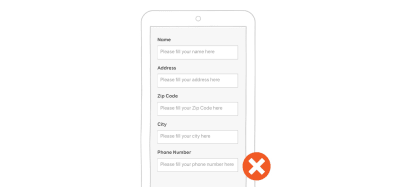 I’m not joking: I’ve actually seen forms with 12 fields, with each placeholder less useful than the last. (Large preview)
Labels inside fields could, nevertheless, work well for short forms in which fields are predictable. Login forms are a good candidate for this. But please don’t use the HTML5 placeholder to code this. Use a real label in the code and move it around with CSS and JavaScript.
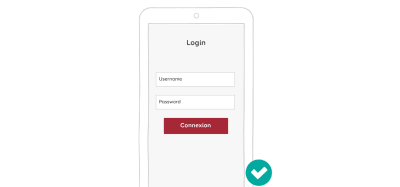 Labels inside fields can work on really short forms, like login forms, where users don’t have a lot of information to remember. (Large preview)
Since the success of Android’s material design, a pattern has started to emerge: the floating label. This label is inside the field when the field is not filled in, so it takes a bit less vertical space on mobile. When users start interacting with the field, the label moves above the field.
This looks like an interesting way to gain some space, without running into the “placeholders in place of labels” issues cited above. Nevertheless, it does not solve the problem of users possibly mistaking a placeholder for filled-in content.
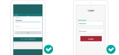 The floating label, even if not perfect, is an interesting alternative to gaining vertical space on the screen. (Large preview) Interaction Cost Reduction For Successful Forms
Reducing the interaction cost (i.e. the number of taps, swipes, etc.) of users achieving their task will help you build a seamless form experience. There are different techniques to achieve that. Let’s look at a few of them in detail.
A Magic Study On The Internet Told Me To Reduce The Number Of FieldsMore fields mean fewer conversions, right? You might have encountered the “we reduced our subscription form from 11 to 4 fields, and it drove up conversions by 160%” study. It’s a classic. And if you look at their contact form, it kind of makes sense. Why would users want to fill in 11 fields just to contact the company? You can’t ask such a big commitment of people who barely know you, right?
Start by asking only for useful information. Why do you need a person’s gender to create an account for them? Why do you have two lines for the address if your subscription form is for an online service?
Ask only for the information you need. And then ask for the information in context. If you have an e-commerce website, users might be more inclined to give you their address in the shipping section of the checkout process than when they register. It will make your e-commerce registration form so much easier to fill on mobile!
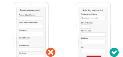 Ask for the user’s address in the shipping section of the checkout, not when they register. (Large preview)
Also, don’t blindly trust every statistic and study you find on the Internet. Remember the 11-fields-to-4 study? Well another more recent study showed that by reducing fields from 9 to 6, conversions dropped by 14%. Shocking, isn’t it? Why? Well, they removed the most engaging fields. Long story short, they then went back to 9 fields, put the most important on the top, and voilà, conversions increased by 19.21%.
The bottom line is that while these studies are interesting, those websites are not your website. Don’t blindly trust the first study you find on the Internet.
So, what can you do? Test. Test. And test!
- Do some user testing to see the time to completion of your mobile form.
- Measure drop outs.
- Measure problems with certain fields.
- Measure the frustration associated with certain fields. How willing are users to give that information? How personal is that information?
If your fields are too small or hard to reach, users will make errors and will need extra interactions to achieve their goals. Remember Fitt’s law? You could apply it to mobile design as well: Make your labels, fields and form controls easy to tap by increasing the touch target size. For labels on the web, a little more padding can increase the touchable area. Sometimes you will also need to add some margins between elements to avoid missed taps.
Also, don’t forget to link labels with their components by pairing for and ID values. That way, if the user misses a tap on the label, the corresponding field will still get focus.
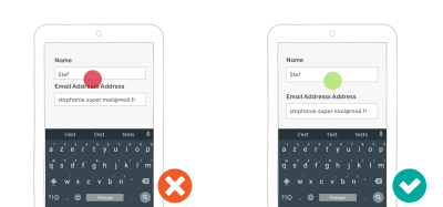 On mobile, respect mobile touch-optimized best practices, and make sure inputs are big enough to be easily tappable. (Large preview)
Steven Hoober conducted some user research on touch areas. You’ll find a summary in “Designing for Touch”. Based on what he discovered, he built a little plastic ruler tool: the mobile touch template. The tool could help you make sure your touch areas are big enough for mobile forms and more generally for mobile design.
 Image from Steven Hoober’s mobile touch template. (Large preview)
To learn more about designing for touch you can read the following:
- “Finger-Friendly Design: Ideal Mobile Touchscreen Target Sizes”
- “The Thumb Zone: Designing for Mobile Users”
Mobile users don’t have a mouse (no kidding), so they don’t get the “click” feedback that desktop users get when hitting a button. Mobile form users need clear feedback when interacting with elements:
- Provide a focus state for the form field that the user is interacting with.
- Provide visual feedback when the user interacts with a button.
I’m not a big fan of material design’s ripple effect on buttons. But I must admit that the animations on Android provide clear feedback when the user interacts with a button.
Honor The Next And Previous Button OrderFinally, honor the next and previous buttons on mobile keyboards. Users can use them to quickly navigate fields. The tabindex order should match the visual order of fields and components.
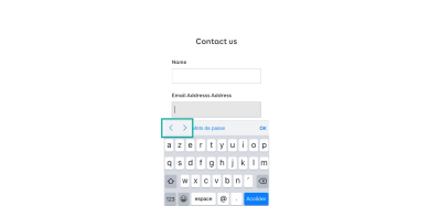 iOS has small arrows on the keyboard to go from one field to another. (Large preview) Avoid Dropdowns On Mobile If Possible
Dropdowns (the HTML select element) on the web require a lot of tabs and interactions. Therefore, as Luke Wroblewski said, they should be the UI of last resort. Many other UI components work better than dropdowns in many situations.
Segment controls and radio buttons are good alternatives to dropdowns if you have between two and four options. Why hide the options under a dropdown when you can show them all directly on one screen? Note that, like radio buttons, segment controls are mutually exclusive.
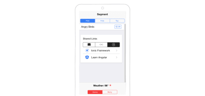 Example of segment controls in the iOnic library. (Large preview)
A country list is a good candidate for a component. A dropdown of over a hundred countries is an interaction nightmare on mobile. It’s OK if you are looking for Afghanistan (at the beginning of the list) or Zimbabwe (the end of the list). If you’re looking for Luxembourg, you will end up in a game of scrolling to reach the middle of the list, going too far to the letter M, trying to come back to L, and so on.
Long dropdowns can be replaced by predictive text input fields. When the user starts typing L, the interface would propose nine countries. If they add a U — voilà! — Luxembourg it is. Four interactions instead of two, versus as many as six or seven scrolling interactions with the dropdown.
 Long dropdowns are a nightmare when you’re searching for France. Predictive fields work better. (Large preview)
If you need users to pick a date, forget about splitting it into a day, month and year dropdown like people are used to doing on paper forms. Replace multiple date dropdowns with a date picker. The HTML5 input type=date works in most cases. But you might have some special needs and end up building your own date picker in JavaScript, especially if you are in the booking business (hotels, cars, flights).
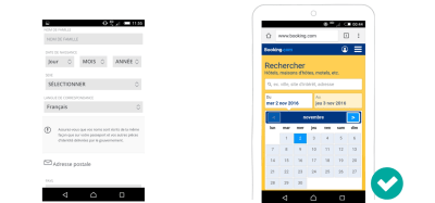 A double date-picker built in JavaScript makes it easy to pick arrival and departure dates with a minimum of interaction (Large preview)
In his article “Mobile DropDowns Revisited”, Klaus Schaefers explains how using a date-picker for arrival and departure dates made interactions 60% faster.
 A date-picker, using HTML5 or JavaScript, instead of dropdowns, via Mobile DropDowns Revisited. (Large preview)
Let’s stick with the booking business. Suppose the user needs to add multiple travellers to their itinerary. You can **replace the dropdown *with a* stepper** to select the number of passengers. A stepper is a control that allows the user to increase and decrease values simply by tapping on + and - buttons. That tends to be faster when fewer than six persons have to be added. It’s also more intuitive. Below is an example of a stepper used in the Android-native Airbnb app to select guests, and on the mobile-optimized website of Kayak to add passengers.
 A stepper is used in the Android-native Airbnb app to select guests and on the mobile-optimized website of Kayak to add passengers. (Large preview)
A final alternative to dropdowns is the list view. The options would be listed in a specific subview, as radio buttons, for instance. This is mostly how Android settings work.
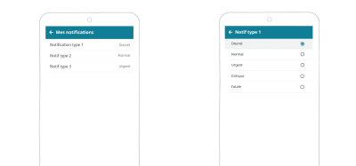 In our monitoring app, when the user clicks on “notification type 1”, it opens a list view with the options. (Large preview) Getting Smart With Auto-Completion
If you want to decrease the interaction cost of your form, be smart. Don’t ask for information that you can auto-detect or guess based on other information users have given you. Autocomplete and prefill as much as you can.
Places and AddressesIf the user searches for a place or needs to enter an address, you can offer auto-completion to help them. As they type, an API would fill in the rest of the address for them. This also reduces errors.
You could use:
- Google Places API
- Algolia Places, which is based on OpenStreetMap
In France and many other countries, you can guess the city based on the area code. So, if a French user enters an area code, you could automatically auto-complete or at least propose the city. My country, Luxembourg, is small (don’t make fun of me). My area code is linked to my street. So, if I enter my area code, the form should even be able to suggest my street.
Credit CardsAnother area where auto-detection is easy is credit cards. You don’t need to ask the user what type of credit card they have. You can auto-detect this based on the initial numbers they enter. There’s even a library that can do the job for you.
A demo of the payment script that detects credit card type.Using HTML5 Autocompletion (Autofill)
The HTML autocomplete attribute can prefill fields based on the user’s earlier inputs. This attribute has an on and off state. Some smart people have started working on a specification to make this more powerful and to extend the autocomplete attribute for form fields. The WHATWG also has an interesting list.
Chrome and other mobile browsers already support some of the extended values for credit cards and names. This means that users can prefill forms with their name and credit card data that they use on other websites.
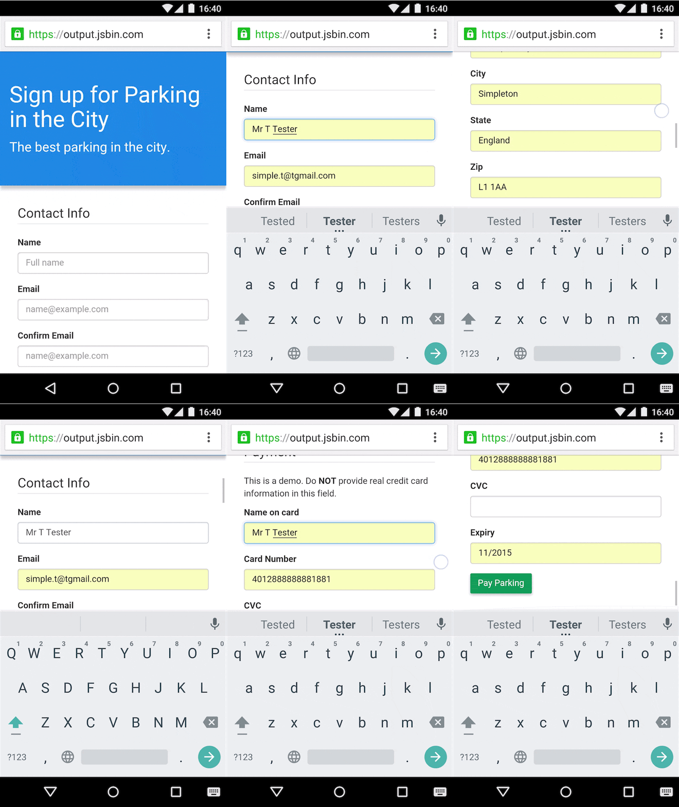 Help users check out faster with Autofill (Source: Google Developers) (Large preview)
In short, when you must choose between different systems, count the number of interactions each is going to require.
Mistakes Happen: Handling Errors In Mobile FormsThe last step on our journey towards better mobile forms is handling errors and mistakes. We can try to reduce mistakes to ease the user’s cognitive load. We can also help them recover from errors, because no matter how great your form design is, mistakes happen.
Avoiding Errors While Filling The Forms“Prevention is better than a cure,” my mother used to say. That’s also true of form design: Preventing errors will improve your mobile form’s experience.
Explicit Format Limitation“Be conservative in what you do. Be liberal in what you accept from others.” This robustness principle can be applied to form fields as well. If possible, let the user enter data in any format.
If you think you need to limit what a user can enter in the field, start by asking yourself “why”. In the user experience field, we have a technique called “the three whys”. If the answer is “because blah blah database”, maybe it’s time to change things. For instance, why do you refuse special characters like é, à and ö in the user name field? I wrote an article explaining how rude forms are to me when I try to enter “Stéphanie” as a user name. I’m still trying to figure out a good reason for that (apart from database reasons).
If you have a good reason to require a specific format from users, state this up front. You can use HTML5 placeholders to give users a hint about what the data should look like, but again, be careful with those. You could also use all of the field description techniques explained at the beginning of this article. Finally, input masks can guide users towards the right format.
Marking Mandatory Fields (And Optional Ones)Don’t wait for users to submit a half-completed form to tell them about required fields. If a field is mandatory, users should know about it. Marking mandatory fields with an asterix (*) and a legend has become a standard pattern for forms. The good part is that it does not take much space. The problem is that it has no semantic value, so it can cause accessibility issues if poorly coded and if you rely on people’s habits with form interaction.
You could instead explicitly mark both mandatory and optional fields with the words “required” (or “mandatory”) and “optional”. Both Baymard Institute and Luke Wroblewski agree on that. This avoids ambiguity with long forms on mobile, such as when using a scroller, proceeding with something else, then coming back and not remembering if mandatory fields were marked with an asterisk or something else.
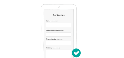 A form with both mandatory and optional fields marked. (Large preview)
Eventually, the decision on how to mark those fields will depend on the design and length of the field and on the context. The best way to know whether you’ve made the right decision is, again, to test the form.
Sensible DefaultsBe careful about default selected options in forms. When I applied for my previous job, there was an information form. The marital status was optional. They made the first element in the dropdown, “divorced”, the default field. So, I could either not answer (because it was an optional field) and let the system believe that I was divorced, or correct this and disclose my actual marital status even if I did not want to.
Also, be careful about gender. Again, have an option for people who don’t want to disclose it; make clear why you’re asking for their gender; better yet, ask for pronouns, or don’t ask if you don’t really need to. If you are interested in this topic, I recommend “Designing Forms for Gender Diversity and Inclusion.” And if the gender is optional, again, don’t auto-check the first choice, otherwise people won’t be able to uncheck that radio button and choose not to answer.
 Should I leave the default and lie, or put the right information even I don’t want to? (Large preview)
Smart defaults, on the other hand, can help users avoid mistakes when filling a form. Unless you’re in a Dr. Who episode, you’re not supposed to book a hotel in the past. Booking.com understands that. When you open the date-picker on the website, the default date is set to the current date and you can’t select a date in the past. When you select a return date, the default is the day after the departure date.
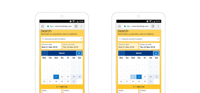 Booking.com’s smart defaults help users avoid mistakes. You can’t search in the past or before your arrival date. (Large preview) Less Painful Password Experience
I’ve written about password-less authentication, but you can’t always use those techniques. Users will eventually have to create a password and enter it in a mobile form. And most of the time, that experience sucks. Here are a few ideas on how to make it better and help users avoid mistakes.
- When Creating An Account
I won’t get into the details of what kind of passwords you should require and how many characters they should be composed of — plenty of articles on that topic are on the web — just make up your mind about your password criteria. When users create an account, be proactive, not reactive. For the love of Cthulhu, don’t let people guess. Tell users your password criteria up front.
A lot of websites now show you a gauge for password strength telling you in real time what is missing. This is an interesting and excellent pattern. KLM uses it in its sign-in form: KLM sign-in form example (Large preview) But there are still some big problems with this design.
- They don’t tell users their password criteria up front. Users who want to generate a password (using a password manager, for instance) must first guess that they need to first interact with the field in other to see the password criteria.
- They limit the password’s length to 12 characters, but they never tell users how many characters are left. Sure, let’s add “counting the dots” to the cognitive load of building a password with so many criteria. After 12 characters, you can keep on typing on the keyboard, and nothing will happen.
- What happens if, like me, you reached the 12-character limit but haven’t met all of the criteria? Well, you would just have to delete the entire password and start over again.
- Finally, you must enter the password twice. How is a user supposed to remember and retype the password that they just created based on those criteria while counting the dots?
- Back to 1, generating a password with a password manager.
If KLM wanted to make this form better, it could provide a mask/unmask option for the password. Doing so, it would not need to ask for the same password twice. Users could visually check that the password they typed is the one they want.
TransferWise doesn’t solve my first problem in the list, but at least I can unmask while typing.
- When Logging In
In a login form, a mask/unmask password option would tremendously improve the user experience.
A button to show and hide the password in a form.Amazon has an interesting history of iterating on passwords in its login form. It used to have a version in which you could not see the password. The next iteration allowed users to reveal it. Then, the password was revealed by default, and you could hide it. This is what is looked like in 2015:
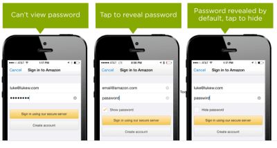 Showing Passwords on Log-In Screens, Luke Wroblewski, 2015 (Large preview)
Amazon tested the last version, and 60% people got suspicious. So, they replaced the “hide password” unchecked checkbox with a “show password” checked box. This would show the password in smaller characters, under the field, while the user typed. This is what it looks like at the time of writing this article:
 Amazon’s show and hide password functionality (Large preview)
As you can see, there’s always room for improvement.
If you are familiar with usability principles, you might know the Gestalt law of proximity. On mobile, avoid the summary of errors at the top of the page, with no contextual information, after the user has tapped the submit button.
Instead, error messages should be located close to the errors themselves.
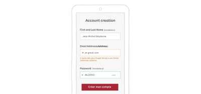 An example of inline validation (Large preview) Real-Time Validation
You also don’t need to wait until users hit the submit button. You can validate fields and display feedback while the user is filling them in.
A few tips:
- As mentioned earlier, password fields would benefit from real-time validation and feedback on each keystroke.
- You might also want to validate user names in real time when accounts are being created, to make sure they’re available. Twitter does a good job of that.
- Don’t validate every keystroke. Wait until the user has finished typing. (Use JavaScript
blurfor web forms, or just wait a few seconds to detect inactivity.)
Note: *Mihael Konjević has written a nice article on “Inline Validation in Forms: Designing the Experience.” He explains the concept of “reward early, punish late.”*
“If the user is entering the data in the field that was in a valid state, perform the validation after the data entry.”
“If the user is entering the data in the field that was in an invalid state, perform the validation during the data entry.”
Example from Keechma based on the article.Color Matters
I’m not saying that color matters just because of my current ginger, pink and purple hair color. Color really matters in form design.
There are some conventions on the web that you don’t want to break. Non-colorblind users know that red is for errors, yellow is for warnings, and green is almost always for confirmation or success. It’s best to stick with these three colors. Red can make people anxious, though. The user might think they’ve made a really serious mistake. Using orange or yellow for error messages could cause less panic. The problem with yellow and orange is that it’s hard to find colorblind-friendly hues of them.
 Colors have different connotations across countries and cultures. Be careful with them. (Large preview)
Speaking of colorblindness: Color should not be the only way to convey an error message. This is an accessibility criterion.
In the example below on the left, the field with an error is in orange, and the field that has been corrected has turned green. I used a colorblind testing tool to take the screenshot in the middle: You can’t distinguish between the default gray border and the green one anymore. Adding some icons in the last screenshot ensures that the error messages are conveyed to colorblind people.
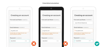 Color should not be the only way to convey error messages. The colorblind simulation in the middle shows that the green border cannot be seen by a colorblind person. (Large preview) Recovering From Errors: Writing User-Friendly Error Messages
At this point, we’ve done everything we can to help users fill our forms and avoid errors. But sometimes, despite our best effort, mistakes happen. It’s time to figure out how to help users recover from those mistakes.
First, remember: Don’t hijack control of the system. If a problem isn’t critical, the user should be able to continue interacting with as much of the rest of the interface as possible. Avoid those JavaScript alert error message and modals that blocks users whenever possible. Also, if your form needs some permission, request it in the flow of use. If permission is not granted, do not consider this an error because it is not. Be careful about the copy you use here.
You’re Not A Robot, And Neither Are Your UsersRobots are cool, I know. But you’re not a robot, and neither are your users. Yet so many error messages are still so poorly written. Here are a few tips when it comes to human-friendly error messages:
- Never show a raw error message, like “An error of type 2393 has occurred. Server could not complete the operation.” Instead, explain what happened in human language and why it happened.
- Never show a dead-end error message, like “An error has occurred.” Instead suggest ways to recover from the error. Write actionable copy.
- Never show a vague error message, like “A server with the specified hostname could not be found”, with a “Try again” button. Instead, make error messages informative and consistent. Please don’t sound like a robot.
- Don’t assume that people know the context of a message. Your users are not tech-savvy geeks. Instead, explain to them in plain language, without technical jargon, how to recover from this error.
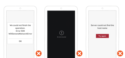 Examples of non-human-friendly error messages. Eek! (Large preview) Beware The Language You Use In Messages
Whatever you write, avoid making people feel stupid about a mistake. If possible, leave out negative words; they tend to scare people and make them even more anxious. Use a courteous, positive, affirming tone instead.
Don’t blame users for mistakes; blame the system instead. The system won’t hold a grudge, I promise. Shift the user’s attention to how the system could not process the action, and explain to them how to find a solution.
A little trick is to read your own message out loud. It will help you hear whether it works or is too harsh or too casual, etc.
You could also get creative with error messages and incorporate imagery and humour to make them less threatening. This will really depend on your brand’s identity and tone, though.
To help you write better error message, I suggest you read the following:
- “A 6-Point Microcopy Checklist For Product Teams Without UX Writers”
- “The Art of the Error Message: Writing Clear, Helpful Copy For When Things Go Wrong”
The user has filled in the form, there are no more errors, and everything looks good. Finally, it’s time to submit the form!
The first rule is, don’t mask the submit button. Seriously! I wonder what twisted mind came up with this idea, but I’ve seen it in some forms. The submit button would be displayed only once all required fields were filled in without any errors. It’s disturbing for the user to wonder whether something is wrong or the form’s button has not loaded or the website is broken and so on.
If you don’t want users to be able to hit the submit button if there’s missing mandatory fields or there are validation errors, use the disabled HTML attribute on the submit input. You will need to re-enable the button using JavaScript once the form is valid and ready for submission.
 Do not hide the submit button. Instead, deactivate it until users have filled in the required information. (Large preview)
If you have a primary and secondary call to action, use color, size and styling to show the hierarchy.
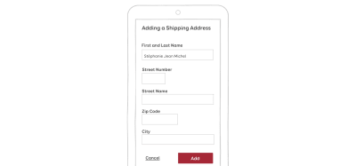 Example of primary and secondary actions (Large preview)
If are wondering whether the confirmation button should come before or after the cancellation button, so am I (and a lot of other people). If you are building a native app, stick to the OS guidelines. It’s become particularly fun since Android changed the button positions in its fourth version. On the web, it’s more complicated because there are no real guidelines. Regardless of the OS, here are some general guidelines for mobile-optimized submit buttons:
- Give the call to action descriptive, actionable verbs.
- Provide visual feedback when the user taps it.
- If you have two buttons, make the primary action stand out.
- Unless you’re working on a very specific back-office enterprise form (in which case, you’ll have a lot of challenges optimizing for mobile), avoid a reset button. Users might confuse it with the submit button and will lose all of their data by accident.
In this first part, I’ve discussed a lot of little techniques to take your form to the next level and help users fill it in. Some of these general guidelines and mobile best practices might not work 100% of the time — that’s the catch with best practices. So, always test your forms on real users and real devices, and adapt the guidelines to your users’ specific needs and experience.
Also, do some regression and automated functional testing — again, on real devices. Chrome’s mobile emulator won’t be enough to test touch-optimized forms. I say this because I had launched an e-commerce website with a search form that didn’t work on mobile. We only did automated testing using an emulator. Here is what happened. The search form was hidden under a search icon. You could tap on the button, which opened a box with the search field. It worked by emulating a mouse hover as a touch event. We tested tapping on the button, and it opened the box. Nobody tried to launch a search. So, nobody (not even the client) saw that the search field disappeared as soon as users tried to interact with it. What happened? When the input element got focus, the button lost the hover state, so it closed the box with the field. Automated testing was not able to catch this because the input was not losing focus. So, we launched an e-commerce website without search functionality on mobile. Not a super experience.
In the second part of this series, we will see more advanced mobile-specific techniques. We will see how to use cool HTML5 features to format fields and how to use mobile capabilities to take the mobile user experience to the next level.
 (lf, ra, al, il)
from Tumblr https://ift.tt/2N2SYbd
No comments:
Post a Comment