Monday, 9 March 2020

Setting Height And Width On Images Is Important Again

Setting Height And Width On Images Is Important Again

Barry Pollard

Web performance advocates have often advised to add dimensions to your images for best performance to allow the page to be laid out with the appropriate space for the image, before the image itself has been downloaded. This avoids a layout shift as the image is downloaded — something Chrome has recently started measuring in the new Cumulative Layout Shift metric.

Well, a dirty, little, secret — not that well-known outside the hard-core web performance advocates — is that, until recently, this actually didn’t make a difference in a lot of cases, as we’ll see below. However, adding width and height attributes to your <img> markup have become useful again after some recent changes in the CSS world, and the quick adoption of these changes by the most popular web browsers.

Recommended Reading

The CSS contain property gives you a way to explain your layout to the browser, so performance optimizations can be made. However, it does come with some side effects in terms of your layout. Read more →

Why Adding Width And Height Were Good Advice

Take for example this simple page:

<h1>Your title</h1>
<p>Introductory paragraph.</p>
<img src="hero_image.jpg" alt=""
   width="400" height="400">
<p>Lorem ipsum dolor sit amet, consectetur…</p>

This might render in two stages, first as the HTML is downloaded, and then second once the image is downloaded. With the above code, this would cause the main content to jump down after the image is downloaded and the space needed to display it can be calculated:

An example layout with a title and two paragraphs, where the second paragraph has to shift down to make space for an image.
Layout shift after image loads. (Large preview)

Layout shifts are very disrupting to the user, especially if you have already started reading the article and suddenly you are thrown off by a jolt of movement, and you have to find your place again. This also puts extra work on the browser to recalculate the page layout as each image arrives across the internet. On a complex page with a lot of images this can place a considerable load on the device at a time when it’s probably got a lot of better things to deal with!

The traditional way to avoid this was to provide width and height attributes in the <img> markup so even when the browser has just the HTML, it is still able to allocate the appropriate amount of space. So, if we change above example to the following:

<h1>Your title</h1>
<p>Introductory paragraph.</p>
<img src="hero_image.jpg" alt=""
   width="400" height="400">
<p>Lorem ipsum dolor sit amet, consectetur…</p>

Then the render happens like below, where the appropriate amount of space is set aside for the image when it arrives, and there is no jarring shift of the text as the image is downloaded:
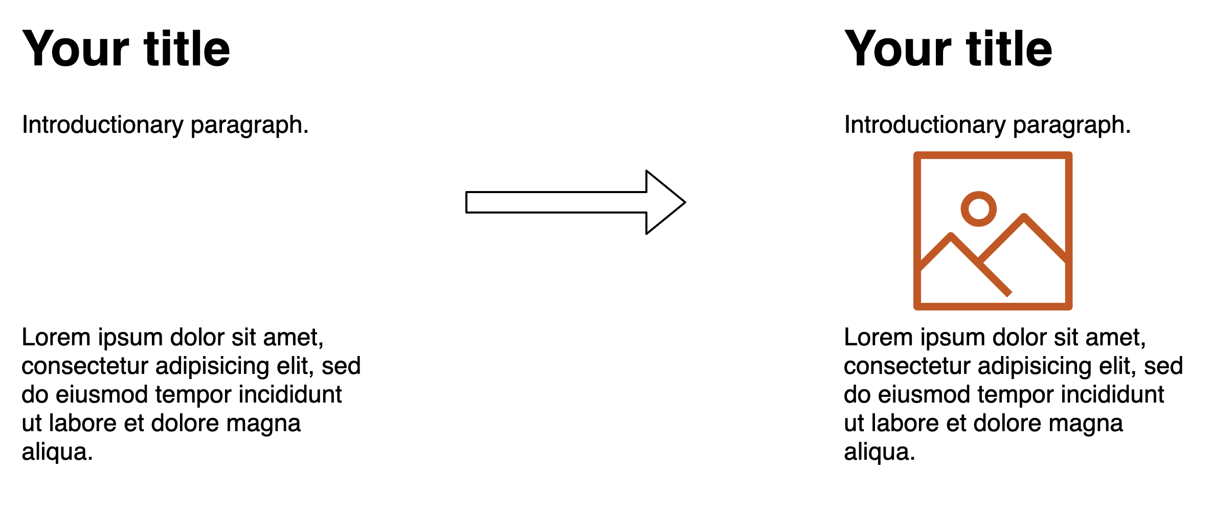
An example layout mockup with a title, a paragraph, space for an image and then a second paragraph, where the text does not shift when the image loads.
Text should not shift if image dimensions are provided so appropriate space can be allocated. (Large preview)

Even ignoring the annoying impact to the user in content jumping around (which you shouldn’t!), the impact on the CPU can also be quite substantial. The below screenshot shows the performance calculations performed by Chrome on a site I work on which has a gallery of about 100 images. The left-hand side shows the calculations when width and height are provided, and on the right when they are not.

Two screenshots from Chrome Dev tools showing various layout timings of 75ms to 450ms on the left, and 124ms to 2709ms on the right.
Performance calculations with and without dimensions. (Large preview)

As you can see, the impact is considerable — especially on lower-end devices and slow network speed, where images are coming in separately. This increases load time by a noticeable amount.

How CSS Interacts With Element Widths And Heights

Widths and heights on an image can cause issues when you try to alter them using CSS. For example, if you want to limit your images to a certain width you might use the following CSS:

img {
  max-width: 100%;
}

This will override the width of the image and constrain it when necessary, but if you have explicitly set the height on the image tag, then we are not overriding that (only the width) and you will end up with a stretched or squashed image, as we have no longer maintained the aspect ratio of the image:

An example layout mockup with a really stretched image.
Image dimensions clashes between HTML and CSS can create stretched (or squashed!) images. (Large preview)

This is actually very easily fixed by adding a height: auto line to the CSS so the height attribute from the HTML is overridden too:

img {
  max-width: 100%;
  height: auto;
}

However, I find it still catches people by surprise and sometimes leads to them not specifying image dimensions in the HTML instead. With no image dimensions, you can get away with just specifying max-width: 200px in the CSS without having to specify height: auto and the browser will automatically figure out the height itself — once it has the image.

So, once we add the dimensions and that the height: auto trick, we get the best of both worlds, right? No layout shifts, but also the ability to resize images using CSS? Well until very recently you might have been surprised to find out the answer was in fact: no (I was — hence why I decided to write this article).

For example, take the code below:

<style>
img {
  max-width: 100%;
  height: auto;
}
</style>
<h1>Your title</h1>
<p>Introductory paragraph.</p>
<img src="hero_image.jpg" alt=""
  height="500" width="500">
<p>Lorem ipsum dolor sit amet, consectetur…</p>

This would have resulted in this load:

Another example layout mockup with a title and two paragraphs, where the second paragraph has to shift down to make space for an image.
Layout shifts happen when height: auto is used in CSS. (Large preview)

Wait, what’s going on here? We’re back to the first problem. I thought I said that by specifying the image dimensions in the HTML you could avoid this layout shift problem? Well, this is where it gets interesting and will lead on to the main point of this article.

The problem is that, unless you were giving explicit width and height CSS values to your images — and who wants to limit themselves like that in a responsive world where you want the image to expand or shrink to fill up the available space — then CSS will need the dimensions from the image file itself to figure out the auto part of the dimensions. It ignored any width and height attributes set in the HTML.

The implication of all this is that specifying width and height attributes on images often wasn’t actually that useful in a lot of cases. Yes, when an image is being shown at full size, without any CSS changing any dimensions, it is useful to resolve the layout shifting problem. However, when you use CSS like below to ensure images do not overflow their available space, then you run into problems as soon as the available width becomes smaller than the actual image size.

img {
  max-width: 100%;
  height: auto;
}

This affects any page where we constrain the image size in a responsive manner — i.e. small screen mobile devices. These are likely to be the very users suffering with network constraints and limited processing power that will suffer most from layout shifts! Of course, we ideally should be delivering appropriately sized images for the screen size, but you cannot cover every device size, so often images will need some resizing by the browser, particularly on mobile.

Many websites may not bother to specify widths and heights on their <img> tags. That could be because they weren’t aware this was useful, or because they were all too aware of what we talked about here and knew it actually wasn’t that useful in a lot of cases. Whatever the reason is beside the point, they are frequently not provided. (How can we even evangelize putting the effort into using them given what I’ve just described?) Even the popular Lighthouse auditing tool doesn’t flag when you don’t do this (though in light of some of the things we’re about to talk about, that is under discussion again).

Working Around The Problem

The limitations for responsive images have been known for a long time and many workarounds, including the so-called padding-bottom hack, have been created to work around the issue. This uses the fact that padding percentages (including padding-bottom ) are always based on the container width (to ensure a consistent padding even if height and width differ). This fact can therefore be used to create a container with where the height is set based on a ratio of the width. For example for, let’s say we have an image with an aspect-ratio of 16:9, then the following CSS code will create the appropriately sized space for the image:

.img-container {
  position: relative;
  padding-bottom: 56.25%; /* 16:9 ratio */
  height: 0;
  overflow: hidden;
}

.img-container img {
  position: absolute;
  top: 0;
  left: 0;
  width: 100%;
  height: 100%;
}

The three main downsides of this technique are the following:

  1. It requires a hard-coded ratio to be calculated (56.25% — 9÷16 — in this example), so it potentially requires custom CSS for each different image.
  2. The CSS code is not exactly easy to remember — forgetting or removing a single line of the above CSS code will break the whole thing. Not to mention this technique requires all images to be wrapped in an extra container element.
  3. This is a more advanced technique that not all web developers know about or use.

And, let’s be honest — it’s a bit of a hack! So, we really should fix this properly, shouldn’t we?

Fixing The Resizing Problem

The issue has been tackled from a few different directions by a number of different standards organizations.

The CSS Working Group (CSS WG) proposed the aspect-ratio property that Rachel wrote about previously. This would tackle the complexity problem (issue 2) once it becomes available, and simplify the above code to just this:

img {
  width: 100%;
  height: auto;
  aspect-ratio: 16/9;
}

Much nicer! This is particularly useful for video where we usually have a set number of commonly used aspect-ratios, so we could create a few classes like above for each size. It’s perhaps less useful for images where dimensions are much less standardized, as it doesn’t solve issue 1 (custom CSS code required per image), nor issue 3 (website developers will need to remember to set this). So, it’s a step forward, but not a full solution.

Separate to this, the Web Incubator Community Group (WICG) — a group of browser developers and other interested parties that can experiment on technologies to see if they work before formal standardisation — also created a proposal to fix this. They proposed the intrinsicsize attribute, that would look like this:

<img intrinsicsize="400x400" style="width: 100%">

As this is an HTML attribute, it can be set per image (solving issue 1), and is relatively easy to code (solving issue 2), but was still likely to suffer from adoption issues (issue 3) unless it became very well-known with a big push from the whole community.

We already have a common, well-known method of setting the width and height on <img> elements (even if they are not used as much as they should be!) so anything new, other than that, is going to suffer from the adoption issue. And that is where the (now seemingly obvious!) answer presented itself.

Jen Simmons proposed this elegant, and simple solution, that she had come up with, along with fantasai:

<style>
  img {
    width: 100%;
    height: auto;
    aspect-ratio: attr(width) / attr(height);
  } 
</style>
<img src="hero_image.jpg" alt="" width="500" height="500">

Rather than hard-coding the aspect-ratio, this uses the attr CSS function to create the appropriate aspect-ratio based on the image width and height attributes provided by the HTML. The attr function has been around for a while, but has been very limited in scope — it’s supported for content by all browsers, but not for the wider use case of any other attribute like width and height, which is what is needed here.

If attr was able to be used for the well-known width and height attributes from img elements, then it could use be used to automatically calculate the aspect-ratio as per above. This would solve issue 1 (no hard-coded aspect ratio needs to be set in the HTML nor the CSS), issue 2 (very simple to add) and, as we shall see, there is a very simple answer to issue 3 (adoption).

Basically, this solution means if the following four conditions are true, then the correct image dimensions could be calculated without needing to wait for the images to download, and so without the need of a content layout shift:

  • height is set on the element in HTML
  • width is set on the element in HTML
  • height (or width) is set in the CSS — including using percentage values like max-width: 100%;
  • width (or height) is set to auto in the CSS.

If any one of these were not set, then the calculation would not be possible, and so would fail and be ignored and have to wait for the image to be downloaded.

So once browsers support using the HTML width and height to calculate the aspect-ratio we can solve our problem very simply with no change in practice to HTML and one line of CSS code! As mentioned above, this is also something many web developers may have already assumed was happening anyway.

Driving Adoption Of This Solution

Because this is just a CSS attribute, the proposal contained a further twist — it could be added to the user-agent stylesheet used by browsers so would not even require any changes from web developers to benefit from this.

The user-agent stylesheet is where default CSS definitions are set (e.g. what font-size the h1 element uses), which can be overridden by your own CSS if you want. By adding the above aspect-ratio one-liner to this we don’t need to drive adoption — we basically turn it on automatically for all sites that meet the above four conditions!

However, this does depend on the attr function having access to the width and height HTML attributes, and also the upcoming aspect-ratio CSS property to be completed — neither of which has happened yet. So instead, as an easier fix, the browsers could implement the equivalent logic deep in rendering code rather than exposing it via the user-agent stylesheet, but the effect is the same. This alternative implementation approach was even suggested as part of the proposal.

Firefox went ahead and did this as an experiment and then turned it on by default for Firefox 71. Once that was released, then your site may well have just got faster for free — thanks Mozilla! Maybe in future, they will move this to the user-agent stylesheet method, but for now, this is sufficient (and perhaps more performant?).

Backwards Compatibility

When introducing a change in behavior, there is always a concern about backwards compatibility and this feature was no different. In theory, as long as the four attributes were appropriately set, there should be no breakage with this.

However, when Firefox initially experimented with it, they discovered problems for those setting the width and height incorrectly in their HTML. Whereas previously these incorrect values would be ignored if the CSS overrode them, now they were being used when auto was set and the images were not displayed correctly and led to squished or stretched images. Now you could argue that web developers shouldn’t set these values incorrectly, and in some cases, it would be already broken even without this change (the case above when you didn’t set height: auto), but still, breaking sites is never a good thing. That is also something the web tries very hard to avoid — and is mostly very good at avoiding that (it’s one of my favorite things about the web as a platform).

The solution to that problem, however, was relatively simple: have the actual image aspect-ratio of the image override any CSS calculated aspect-ratio. This way the (incorrectly) calculated aspect-ratio can be used for initial layout, but then can be recalculated when the image is downloaded, so the image is displayed as it was before. This does cause a layout shift (since the incorrect space was allocated initially) but that was happening before anyway, so it’s no worse. In fact, it’s often a lot better as an incorrect aspect ratio will often be closer to the truth than a zero aspect-ratio.

Rollout To Other Browsers

After Firefox’s successful experimentation, Chrome also decided to implement this (again using the layout coded method for now rather than default user-agent stylesheet), and rolled it out by default in Chrome 79. This also took care of the other chromium-based browsers (Edge, Opera and Brave, for example). More recently, in January 2020, Apple added it to their Tech Preview edition of Safari, meaning it should hopefully be coming to the production version of Safari soon, and with that, the last of the major browsers will have implemented this and the web will become better and less jolty for a huge number of sites.

Limitations

There are a few limitations to be aware of with this feature, including issues with:

  • Art Direction
  • Lazy Loading
  • Non-Images

Art Direction

The fix works great to calculate the aspect-ratio based on a fixed width and height, but what about when those change? This is known as art direction and an example is shown below:

Two example page layout mockups with the first being a desktop layout using a wide banner-style image, and the second, mobile, layout using a square image.
‘Art direction’ uses different photographs depending on the available space. (Large preview)

In this case we are using a wide image for desktop, and then a square, cropped image for mobile. Responsive images can be implemented using srcset attributes on an <img> element:

<img
  srcset="hero_800x400.jpg 800w, hero_400x400.jpg 400w"
  sizes="(min-width: 327px)" 800px 400px
  src="hero_800x400.jpg" alt=""
  width="800" height="400">

or with the <picture> element like this:

<picture>
  <source media="(min-width: 327px)"
     type="image/jpeg" srcset="hero_800x400.jpg">
  <source type="image/jpeg"
     srcset="hero_400x400.jpg">
  <img src="hero_800x400.jpg" alt=""
     width="800" height="400">
</picture>

Currently, both these elements only allow the width and height to be set once on the main, fallback <img> element and not on the individual <srcset> alternatives. Adding these has been proposed but until then, this is currently a limitation of the solution, and using images with different dimensions will still experience a layout shift.

Lazy Loading

This feature would be perfectly suited for use with lazy-loading. Ideally, all lazy-loaded images are loaded off-screen as you scroll down the page before the lazy-loaded image enters the viewport, but often this is not the case depending on how fast the user scrolls and the network, so having the image area correctly set would at least avoid the layout shift after loading does occur. Additionally, even when loading is happening off-screen, layout shifts can be costly in terms of CPU time, as we have shown above.

However, lazy loading techniques may involve not using an <img> element, or at least one without a src (to prevent the browser from downloading the image by default). Therefore, it may not be able to benefit from this recent change depending on how your browser handles the element used or src-less <img> elements. Though if the CSS version of this solution becomes available, then website developers will have greater control over specifying aspect-ratio themselves.

Native lazy loading was recently released by the Chrome team and it has since been added to the HTML spec. Other browsers are also looking to support this with Firefox also getting this soon, and Safari hopefully not too much later. That does make use of the <img> element with a src with syntax like the following (including when used as part of the <picture> element):

<img src="hero_800x400.jpg" alt=""
  width="800" height="400" loading="lazy">

Perfect! Well, unfortunately, I discovered this height and width solution is not compatible with the recently released native lazy-loading functionality as can be seen on this test page. I’ve raised a bug for this issue and hopefully the Chrome team will fix this soon.

Non-Images

Currently, the browsers that have implemented this, have only done for the <img> element, but it would also be useful for <video>, <iframe> and <object> elements to name a few, and this under discussion. Again, if the CSS version of this technique becomes available through the attr functions and aspect-ratio property, then that puts the power in the website developer to implement this for whatever elements they want!

Conclusion

I love improvements that just work without any effort required of website owners. That is not to ignore the hard work required by the browser developers and standardization teams, of course, but it’s often rolling out to websites that is the real difficulty. The less friction we can add to introduce these improvements, the more likely they will be adopted, and there’s no better friction than none at all! Fixing the impact of layout shifts on users for responsive images seems to be one such improvement and the web is all the better for it.

The one change that is required of us web developers is to ensure we are providing width and height attributes in our markup. It’s a habit we shouldn’t really have gotten out of, and many CMS and publishing tools make this relatively easy. I queried the HTTPArchive and it looks like 62% of <img> tags have width or heights, which is way higher than I expected to be honest — but let’s try to increase that statistic even more now we have a reason to again. So, I implore you to check that you are doing this on your sites and, if not, start to. It will improve the experience for your users and ultimately make them happier, and who doesn’t want that?

Smashing Editorial
(jw, yk, il)

from Tumblr https://ift.tt/2PY1Dzd
Friday, 6 March 2020

Avoid Keyboard Event-Related Bugs In Browser-Based Transliteration

Avoid Keyboard Event-Related Bugs In Browser-Based Transliteration

Sandamal Siripathi

Google’s multi-language input method, known as Google Input Tools is a good example of a web app that uses transliteration to input non-English characters. The basic idea is to have a text box, in which users spell the words of their own language, using English characters. They usually type those words using an English keyboard. The web app converts the typed English keystrokes into characters of their local (non-English) language, and displays those non-English characters in the text box in real-time. Users can copy the text from the text box and paste it into whatever the text field or search bar on another web page or app.

In this article, we’ll see how Google Input Tools behaves on a desktop and a mobile browser and identify its weakness, when running on the Chrome browser on Android. We’ll also compare that with the performance of our alternative JavaScript code snippet, and appreciate how it avoids the issues related to the Chrome mobile browser. You can use this method when you develop your own alternative to Google Input Tools in the future.

Using The Web With Just A Keyboard

Many of us are taught to make sure our sites can be used via keyboard. Why is that, and what is it like in practice? Chris Ashton did an experiment to find out. Read a related article →

Google Input Tools

Below you can see how Google Input Tools works on a desktop and a mobile browser. It is obvious that transliteration doesn’t work on Chrome mobile browser (on Android) due to some kind of a bug. You can check for yourself by visiting Google Input Tools on a PC and a mobile device running Android with Chrome browser.

We’ll try it out by typing a very simple word in Sinhala, an official language of the South Asian island, Sri Lanka. We’ll type the Sinhala word “à¶´à·„à¶±”, meaning “lamp” in English. The mapping specified by Google Input Tools is “pa” for “à¶´”, “ha” for “à·„” and “na” for “à¶±”. So, just type “pahana” in the Google Input Tools text box and hit Enter. The mapped Sinhala characters, “à¶´à·„à¶±” will appear in the textbox.

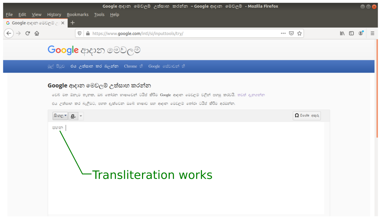
Try this on a desktop and an Android mobile device with the Chrome browser. As seen in the images below, it works on the Firefox desktop browser but fails on the Chrome mobile browser.

Google Input Tools on Firefox on Desktop
Transliteration works on Firefox browser on Ubuntu desktop PC. (Large preview)
Transliteration does not work on Chrome browser on Android mobile device. (Large preview)

How did it happen? It works perfectly on a desktop browser, but fails on the Chrome mobile browser running on Android.

Two Possible Methods

Conversion of keystrokes can easily be implemented using JavaScript. If word prediction is also involved, then there’s a need for a back-end database and hence PHP, but the basic functionality can be achieved only with JavaScript.

Two methods could be used to implement this. Here, we’ll limit our example to a very simple input method design, where each non-English character can directly be mapped to a unique single keystroke.

For example, we could map the non-English (Sinhala) character “à¶´” to the English character “p”, or the key “p” on the keyboard.

  1. Method 1 (Typical Method):
    Prevent Default Behavior and Capture Keyboard Event

    There are two main steps to achieve this with JavaScript in method 1. First, the default behavior when a key is pressed or held down must be stopped. Then the desired character or characters to be typed must be specified in the KeyPress, KeyDown or KeyUp event capture functions./>
    The default behavior when a key is pressed or held down, is to type the character associated with that key on the keyboard. For example, when the key “p” is pressed, the English character “p” will be typed in the text box by default. We could prevent this default behavior and replace the default character for any key, with a non-English character of our choice./>
    In our example, we’ll prevent typing of “p” when the key “p” is pressed and programmatically insert the mapped character “à¶´” instead of character “p”. We can do this for all the mapped characters on the keyboard.
  2. Method 2 (New Method):
    Listen to the Textbox Input and Modify the Contents in Real-Time, Based on Latest Input

    In this method, we are not dealing with any keyboard events. Instead, we’ll keep track of the latest input character in the textbox and replace that character with a non-English character of our choice.

    In the background, our script must be listening to the changes in the contents of the textbox. When the key “p” is pressed let “p” be typed. When the script detects that the last typed character is “p”, it must programmatically delete that typed “p” and replace it with “à¶´”. In a similar fashion, any non-English character can be typed by assigning them to an English character through an appropriate mapping.

    Whenever an English character is typed by pressing a key on the keyboard, all you have to do is to programmatically delete that typed character and replace it with the non-English character specified in the mapping.

Which Method Does Google Input Tools Use?

From what’s happening in the two different scenarios, it seems that Google Input Tools is using the first method (Method 1), which is also the typical way of implementing such functionality. Now that we’ve invented a new method (Method 2), it’s time for a little bit of experimentation.

Let’s Compare the Two Methods

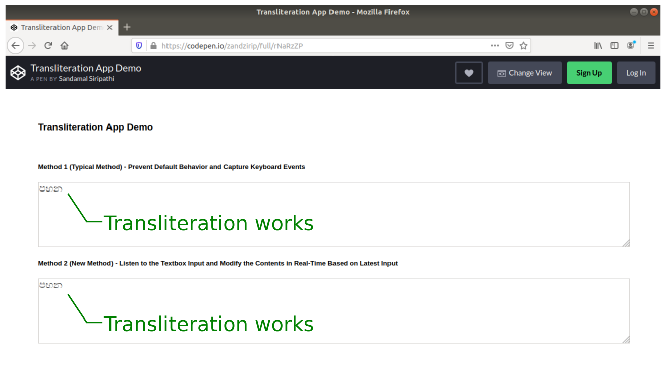
Below you can compare how the two different methods perform on Firefox on a laptop and Chrome mobile browser on an Android mobile device. Unlike Google Input Tools, which uses more than one English character per non-English character, we have already used a one-to-one mapping for simplicity. According to our mapping, “p” equals “à¶´”, “h” equals “à·„”, and “n” equals “à¶±”. So, just type “phn” to produce the Sinhala word “à¶´à·„à¶±”.

Only Method 2 (that’s our new method) can handle both laptop and Chrome mobile browser without any problem. Method 1 (the typical method) fails when it comes to the Chrome mobile browser.

Codepen on Firefox on Desktop
The Firefox browser on Ubuntu desktop PC : Both Method 1 and Method 2 can correctly handle transliteration. (Large preview)
Codepen on Chrome on Android Mobile Device
Chrome browser on Android: Method 1 fails to handle transliteration correctly while Method 2 is capable of handling transliteration correctly. (Large preview)

You can also visit my CodePen and verify by yourself.

Fix Another Minor Issue

If you experience some unexpected results when you type using transliteration on your Android mobile, that’s because you have enabled text prediction on your mobile’s soft keyboard. Just disable text prediction, auto suggestions plus auto-capitalization and it should work like magic.

However, SwiftKey (pre-installed on most Huawei phones) doesn’t allow the word prediction to be disabled. So, installing an alternative such as a Gboard keyboard will fix that problem. Disable text prediction plus auto-suggestions and start typing.

This following CodePen example provides you with the complete source code:

See the Pen [Transliteration App Demo](https://codepen.io/smashingmag/pen/eYNGzqW]) by Sandamal Siripathi.

See the Pen Transliteration App Demo by Sandamal Siripathi.

Code Review

To demonstrate Method 1 and Method 2, I created two text areas named textarea1 and textarea2 in a normal HTML file. Then I added some CSS styling to make them look nice on the web page. Using two JavaScript scripts to change the contents of those two textboxes, I was able to implement the two methods, which I wanted to experiment with.

For Method 1

I devised a method to capture the keydown event and call a function named “whichKey” when the keydown event fires. JavaScript onkeydown event fires whenever a user presses a key on the keyboard. I used that to capture the keyboard event.

Function whichKey handles the core job of preventing default behavior when a key is pressed. It then calls another function named “typeIt1”, which is responsible for typing the actual non-English (Sinhala) characters according to the mapping of our choice. Whenever a key is pressed on the keyboard, the function whichKey passes that pressed key to the function typeIt1, which in turn types the relevant Sinhala character in the text box.

You can refer to the well-commented example on CodePen and see for yourself how that has been achieved:

See the Pen [Transliteration App Demo](https://codepen.io/smashingmag/pen/rNVGMNw]) by Sandamal Siripathi.

See the Pen Transliteration App Demo by Sandamal Siripathi.

For Method 2

Since the bug on Chrome browser on Android, fails to perform the transliteration correctly, it still displays the English characters instead of converting them to Sinhala characters. Yet, it works fine on a desktop browser. So, I suspected the bug was caused by not correctly capturing the keyboard events on the Chrome browser running on Android.

Since fixing the browser bug was clearly beyond my capabilities, I decided to go for a clever trick. What if I could avoid the bug, rather than trying to fix it? With a little more innovative thinking, I was able to come up with a solution.

I switched to a completely new method that doesn’t rely on keyboard event capturing. My idea was to keep track of the changes in the contents of the textbox. When a key is pressed, the contents of this textbox will naturally change. Based on that change, it’s always possible to introduce another change, using JavaScript.

For example, start with an empty textbox. Now, suppose the key “p” was pressed. Then the textbox’s contents will change from blank to “p”. The script running in the background will detect this change and replace “p” with a non-English character of my choice. This choice could be based on some predetermined mapping between English characters on the keyboard and non-English characters of the language, in which we want to type.

To demonstrate this, I added an oninput event to textarea2. I specifically selected oninput instead of onchange, because the latter updates the contents only after the textbox loses focus, while the former updates it immediately on pressing the keys. When the oninput event fires, it will call a function named “typeIt2”, which handles the process of replacing the typed English character with the relevant non-English character.

Again, there’s another example on CodePen that describes all of the necessary information you need to understand how this has been implemented.

See the Pen [Transliteration App Demo](https://codepen.io/smashingmag/pen/rNVGMaz]) by Sandamal Siripathi.

See the Pen Transliteration App Demo by Sandamal Siripathi.

Conclusion

It’s obvious that our new method can successfully avoid the transliteration-related problem on the Chrome browser running on Android. Although we used a one-to-one mapping between English and non-English characters for the sake of simplicity, such a simple mapping might not be always possible. Most of these languages — especially the Asian ones — are full of very complex features and may require more advanced mappings. Sinhala language, for example, has independent vowels, consonants, dependent vowel signs, additional dependent vowel signs, punctuation and various other signs.

Note: For more details about Sinhala Unicode code charts, you can visit the relevant page on The Unicode Consortium. If you are thinking of developing text input apps for non-English languages, I recommend you visit The Unicode Consortium and improve your knowledge about Unicode before actually starting your project. It provides you with full coverage of the subject including the basics, best practices, and in-depth technical details.

If you ever wanted to develop an alternative to Google Input Tools, now you are in a better position to do that.

Smashing Editorial
(dm, il)

from Tumblr https://ift.tt/2TqykY6

Thursday, 5 March 2020

Introducing Alpine.js: A Tiny JavaScript Framework

Introducing Alpine.js: A Tiny JavaScript Framework

Phil Smith

Like most developers, I have a bad tendency to over-complicate my workflow, especially if there’s some new hotness on the horizon. Why use CSS when you can use CSS-in-JS? Why use Grunt when you can use Gulp? Why use Gulp when you can use Webpack? Why use a traditional CMS when you can go headless? Every so often though, the new-hotness makes life simpler.

Recently, the rise of utility based tools like Tailwind CSS have done this for CSS, and now Alpine.js promises something similar for JavaScript.

In this article, we’re going to take a closer look at Alpine.js and how it can replace JQuery or larger JavaScript libraries to build interactive websites. If you regularly build sites that require a sprinkling on Javascript to alter the UI based on some user interaction, then this article is for you.

Throughout the article, I refer to Vue.js, but don’t worry if you have no experience of Vue — that is not required. In fact, part of what makes Alpine.js great is that you barely need to know any JavaScript at all.

Now, let’s get started.

What Is Alpine.js?

According to project author Caleb Porzio:

“Alpine.js offers you the reactive and declarative nature of big frameworks like Vue or React at a much lower cost. You get to keep your DOM, and sprinkle in behavior as you see fit.”

Let’s unpack that a bit.

Let’s consider a basic UI pattern like Tabs. Our ultimate goal is that when a user clicks on a tab, the tab contents displays. If we come from a PHP background, we could easily achieve this server side. But the page refresh on every tab click isn’t very ‘reactive’.

To create a better experience over the years, developers have reached for jQuery and/or Bootstrap. In that situation, we create an event listener on the tab, and when a user clicks, the event fires and we tell the browser what to do.

See the Pen Showing / hiding with jQuery by Phil on CodePen.

See the Pen Showing / hiding with jQuery by Phil on CodePen.

That works. But this style of coding where we tell the browser exactly what to do (imperative coding) quickly gets us in a mess. Imagine if we wanted to disable the button after it has been clicked, or wanted to change the background color of the page. We’d quickly get into some serious spaghetti code.

Developers have solved this issue by reaching for frameworks like Vue, Angular and React. These frameworks allow us to write cleaner code by utilizing the virtual DOM: a kind of mirror of the UI stored in the browser memory. The result is that when you ‘hide’ a DOM element (like a tab) in one of these frameworks; it doesn’t add a display:none; style attribute, but instead it literally disappears from the ‘real’ DOM.

This allows us to write more declarative code that is cleaner and easier to read. But this is at a cost. Typically, the bundle size of these frameworks is large and for those coming from a jQuery background, the learning curve feels incredibly steep. Especially when all you want to do is toggle tabs! And that is where Alpine.js steps in.

Like Vue and React, Alpine.js allows us to write declarative code but it uses the “real” DOM; amending the contents and attributes of the same nodes that you and I might edit when we crack open a text editor or dev-tools. As a result, you can lose the filesize, wizardry and cognitive-load of larger framework but retain the declarative programming methodology. And you get this with no bundler, no build process and no script tag. Just load 6kb of Alpine.js and you’re away!

Alpine.js JQuery Vue.js React + React DOM
Coding style Declarative Imperative Declarative Declarative
Requires bundler No No No Yes
Filesize (GZipped, minified) 6.4kb 30kb 32kb 5kb + 36kb
Dev-Tools No No Yes Yes

When Should I Reach For Alpine?

For me, Alpine’s strength is in the ease of DOM manipulation. Think of those things you used out of the box with Bootstrap, Alpine.js is great for them. Examples would be:

  • Showing and hiding DOM nodes under certain conditions,
  • Binding user input,
  • Listening for events and altering the UI accordingly,
  • Appending classes.

You can also use Alpine.js for templating if your data is available in JSON, but let’s save that for another day.

When Should I Look Elsewhere?

If you’re fetching data, or need to carry out additional functions like validation or storing data, you should probably look elsewhere. Larger frameworks also come with dev-tools which can be invaluable when building larger UIs.

From jQuery To Vue To Alpine

Two years ago, Sarah Drasner posted an article on Smashing Magazine, “Replacing jQuery With Vue.js: No Build Step Necessary,” about how Vue could replace jQuery for many projects. That article started me on a journey which led me to use Vue almost every time I build a user interface. Today, we are going to recreate some of her examples with Alpine, which should illustrate its advantages over both jQuery and Vue in certain use cases.

Alpine’s syntax is almost entirely lifted from Vue.js. In total, there are 13 directives. We’ll cover most of them in the following examples.

Getting Started

Like Vue and jQuery, no build process is required. Unlike Vue, Alpine it initializes itself, so there’s no need to create a new instance. Just load Alpine and you’re good to go.

<script src="https://cdn.jsdelivr.net/gh/alpinejs/alpine@v1.9.4/dist/alpine.js" defer></script>

The scope of any given component is declared using the x-data directive. This kicks things off and sets some default values if required:

<div x-data="{ foo: 'bar' }">...</div>

Capturing User Inputs

x-model allow us to keep any input element in sync with the values set using x-data. In the following example, we set the name value to an empty string (within the form tag). Using x-model, we bind this value to the input field. By using x-text, we inject the value into the innerText of the paragraph element.

See the Pen Capturing user input with Alpine.js by Phil on CodePen.

See the Pen Capturing user input with Alpine.js by Phil on CodePen.

This highlights the key differences with Alpine.js and both jQuery and Vue.js.

Updating the paragraph tag in jQuery would require us to listen for specific events (keyup?), explicitly identify the node we wish to update and the changes we wish to make. Alpine’s syntax on the other hand, just specifies what should happen. This is what is meant by declarative programming.

Updating the paragraph in Vue while simple, would require a new script tag:

new Vue({ el: '#app', data: { name: '' } });

While this might not seem like the end of the world, it highlights the first major gain with Alpine. There is no context-switching. Everything is done right there in the HTML — no need for any additional JavaScript.

Click Events, Boolean Attributes And Toggling Classes

Like with Vue, : serves as a shorthand for x-bind (which binds attributes) and @ is shorthand for x-on (which indicates that Alpine should listen for events).

In the following example, we instantiate a new component using x-data, and set the default value of show to be false. When the button is clicked, we toggle the value of show. When this value is true, we instruct Alpine to append the aria-expanded attribute.

x-bind works differently for classes: we pass in object where the key is the class-name (active in our case) and the value is a boolean expression (show).

See the Pen Click Events, Boolean Attributes and Toggling Classes with Alpine.js by Phil on CodePen.

See the Pen Click Events, Boolean Attributes and Toggling Classes with Alpine.js by Phil on CodePen.

Hiding And Showing

The syntax showing and hiding is almost identical to Vue.

See the Pen Showing / hiding with Alpine.js by Phil on CodePen.

See the Pen Showing / hiding with Alpine.js by Phil on CodePen.

This will set a given DOM node to display:none. If you need to remove a DOM element completely, x-if can be used. However, because Alpine.js doesn’t use the Virtual DOM, x-if can only be used on a <template></template> (tag that wraps the element you wish to hide).

Magic Properties

In addition to the above directives, three Magic Properties provide some additional functionality. All of these will be familiar to anyone working in Vue.js.

  • $el fetches the root component (the thing with the x-data attribute);
  • $refs allows you to grab a DOM element;
  • $nextTick ensures expressions are only executed once Alpine has done its thing;
  • $event can be used to capture a nature browser event.

See the Pen Magic Properties by Phil on CodePen.

See the Pen Magic Properties by Phil on CodePen.

Let’s Build Something Useful

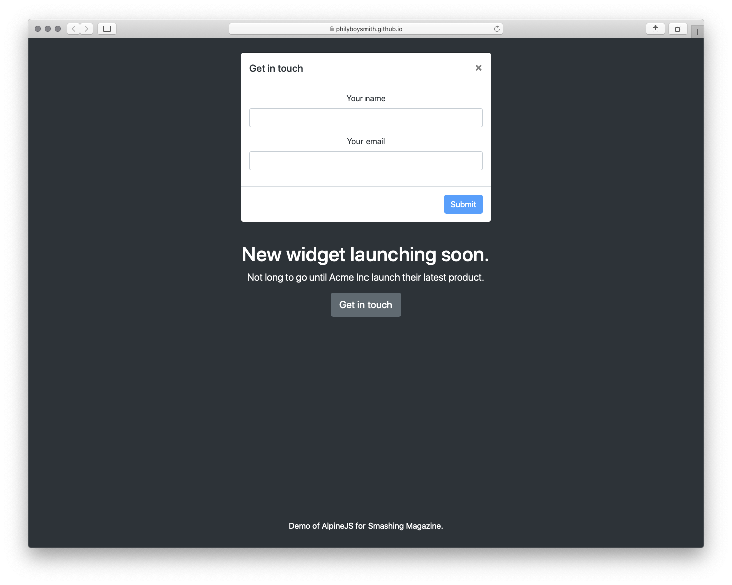
It’s time to build something for the real world. In the interests of brevity I’m going to use Bootstrap for styles, but use Alpine.js for all the JavaScript. The page we’re building is a simple landing page with a contact form displayed inside a modal that submits to some form handler and displays a nice success message. Just the sort of thing a client might ask for and expect pronto!

Initial view of the demo app
Initial view (Large preview)
View of the demo app with modal open
Modal open (Large preview)
View of the demo app with success message displaying
Success message (Large preview)

Note: You can view the original markup here.

To make this work, we could add jQuery and Bootstrap.js, but that is quite a bit of overhead for not a lot of functionality. We could probably write it in Vanilla JS, but who wants to do that? Let’s make it work with Alpine.js instead.

First, let’s set a scope and some initial values:

<body class="text-center text-white bg-dark h-100 d-flex flex-column" x-data="{ showModal: false, name: '', email: '', success: false }">

Now, let’s make our button set the showModal value to true:

<button class="btn btn-lg btn-secondary" @click="showModal = true" >Get in touch</button>
 

When showModal is true, we need to display the modal and add some classes:

<div class="modal  fade text-dark" :class="{ 'show d-block': showModal }" x-show="showModal" role="dialog">
 

Let’s bind the input values to Alpine:

<input type="text" class="form-control" name="name" x-model="name" >
<input type="email" class="form-control" name="email" x-model="email" >
 

And disable the ‘Submit’ button, until those values are set:

<button type="button" class="btn btn-primary" :disabled="!name || !email">Submit</button>

Finally, let’s send data to some kind of asynchronous function, and hide the modal when we’re done:

<button type="button" class="btn btn-primary" :disabled="!name || !email" @click="submitForm({name: name, email: email}).then(() => {showModal = false; success= true;})">Submit</button>
 

And that’s about it!

See the Pen Something useful built with Alpine.js by Phil on CodePen.

See the Pen Something useful built with Alpine.js by Phil on CodePen.

Just Enough JavaScript

When building websites, I’m increasingly trying to ask myself what would be “just enough JavaScript”? When building a sophisticated web application, that might well be React. But when building a marketing site, or something similar, Alpine.js feels like enough. (And even if it’s not, given the similar syntax, switching to Vue.js takes no time at all).

It’s incredibly easy to use (especially if you’ve never used VueJS). It’s tiny (< 6kb gzipped). And it means no more context switching between HTML and JavaScript files.

There are more advanced features that aren’t included in this article and Caleb is constantly adding new features. If you want to find out more, take a look at the official docs on Github.

Smashing Editorial
(ra, il)

from Tumblr https://ift.tt/3cwlY8g

Wednesday, 4 March 2020

Why Are We Talking About CSS4?

Why Are We Talking About CSS4?

Rachel Andrew

There has been some discussion recently about whether there should be a CSS4, as in a defined “next version” of CSS. In this article, I take a look at the discussions around this, the pros and cons of creating a feature release for CSS, and the potential problems in deciding what goes into it.

I’m using the term CSS4 as that is how the discussion was started, and not attempting to discuss what the naming should actually be, should this approach be taken forward. Bikeshedding naming is an excellent distraction from the discussion of whether we should do this at all, so I will use CSS4 as a placeholder for the version of CSS we are proposing to define, and CSS5 for the next one along the line.

The Issue

A discussion around whether we should define a CSS4 has been raised in the community, and Jen Simmons then raised a CSS Working Group issue which neatly rounds up some of that existing debate. Outside of the actual issue that we are discussing, it is fantastic to see so many people who are not part of the CSS WG replying on this thread, and I hope that having commented once, people will be happy to come and comment on some of our other issues.

In order to understand why there is no CSS4, we need to look at a little bit of web platform history. The initial versions of CSS were as a single, monolithic specification. These specifications contained every possible CSS property and value. This worked well as there wasn’t a lot of CSS to detail. CSS1 mostly covered features for formatting text documents, additional features and clarifications were added to CSS2 and CSS2.1 however CSS was still a relatively small specification.

CSS3

At the point the CSS Working Group began work on CSS3, it was decided to split the big spec into modules. These modules would each cover part of CSS. Not all of CSS was immediately placed into a new module. Many things remained defined in CSS2.1 as there were no changes or additions to them. For this reason, you will still find links to the CSS2 specification in modern modules, if the thing that is being referenced is still defined in CSS2. However, any new CSS is created in separate modules. This modularization continues today as new CSS is being created. For example, several of the features that make up the Box Alignment specification initially started life in the Flexbox spec. Once it became apparent that they could apply to other layout methods such as Grid Layout, they were moved into a new module to be defined for that other method too.

We stopped referring to new specifications as CSS3 Specifications, partly because it didn’t make a lot of sense. The way that modules are versioned is that the modules which were a progression of CSS2, for example Selectors, became a Level 3 module. Brand new CSS, for example CSS Grid Layout, did not exist at all in CSS2 and so start life as a Level 1 module. Some of those initial modules are now at Level 4 or even Level 5. Therefore, calling all new CSS CSS3 doesn’t map to the level numbers anymore, and is potentially rather confusing.

Specification Maturity Levels

In addition to specification levels, each individual level goes through a staged process from the initial draft to becoming a W3C Recommendation, the steps in the process are referred to as Maturity Levels. A W3C Recommendation is what you might think of as a “web standard”, however many of the things we use daily in our work are defined in specifications that are not at that maturity level yet. You can see the list of specifications and their status on the CSS WG Current Work page.

Explaining The Missing CSS4

Many of us involved with the process saw the confusion about CSS3 or the apparent lack of progress to CSS4 and began to write articles, post videos, and try to help people understand a bit about how the process actually worked. That said, while it was important to share this information so that people teaching CSS would explain it correctly, I am not sure how much this information matters to the average web developer. What level a specification is at, or the internal W3C process of specification maturity, is far less important to a web developer than the issue of what CSS can actually be used in browsers.

What Are The Benefits Of Versioning CSS?

Looking through the responses to the issue, and the discussion around the web, there are certainly some potential benefits of having a clear version number for CSS.

As a writer of books and a producer of educational materials, I would probably benefit from CSS version numbers. It’s an excuse to publish an updated book that covers the latest and greatest version of CSS. On the other side of that, it is a way for the purchasers of books and courses to be sure that what they are buying is reasonably up to date - although the publishing date is arguably a better indication of that than anything else.

One thing we did lose by moving away from a version number of all of CSS, was the ability to do something like the Acid Test. The Acid 1 Test tested for support of CSS1, Acid 2 for support of CSS2.1. These tests were reasonably well known and seen as a good benchmark for browser support of web standards. A version 3 test was developed, however, it tested for a range of features and was less tightly tied to the Level 3 CSS Modules than previous tests had been to CSS1 and 2.1. A definite line drawn around a set of features would allow for user agents to declare their level of support for those features.

Some commenters on the issue have mentioned that a version would allow them to push for dropping of older browser versions because they “don’t support CSS4”.

“[…] perhaps CSS4 could help to push their mindset towards a more secure and better web. During pitch meeting, it’s hard to tell them we can’t support IE10 because we want CSS Variables and Grid Layout. Stakeholders do not know and do not care. They just want to support as many browsers as they could (very typical FOMO mindset) and they have the dollars to throw.

However, if we could tell them we can’t support IE10 because it doesn’t have the latest CSS4 technology and throw them the “Are you sure you want your newly created website to be behind your competitors because of that?” question, that might ponder them (of course, on top of the fact that IE10 is completely obsolete and vulnerable).”

There is an argument that defining a version gives developers a clear set of things to learn. In opening the issue on the CSS WG Jen Simmons said,

“I see a lot of resistance to learning the CSS that came after CSS3. People are tired and overwhelmed. They feel like they’ll never learn it all, never catch up, so why try, or why try now? If the CSSWG can draw a line around the never-ending pile of new, and say ‘Here, this. This part is ready. This part is done. This part is what you should take the time to learn. You can do this. It’s not infinite.’ I believe that will help tremendously.”

What Are The Problems Of Versioning CSS?

The first issue is that any collection of “ready for the primetime” CSS, is not as straightforward as selecting a set of specifications. Many specifications are partially implemented, with great support for some properties and none for others. There are features which many web developers would see as mature, sat in specifications still at Working Draft status alongside features which are still being debated and clarified in the Working Group.

If we take Multiple-column Layout as an example. The majority of properties have had widespread browser implementation for many years. However, the column-span property has only recently been implemented in Firefox, and there are a number of features that have recently been clarified, such as column-fill.

We could decide to ignore specifications altogether and look at properties. That isn’t straightforward either due to the fact that we have partial implementations across layout methods. The Box Alignment Properties are an excellent example. These are defined for all layout methods, where the property makes sense in that layout method. However support for Box Alignment is currently only seen in Grid and Flexbox. Therefore is justify-self, which is defined for block-level boxes, absolutely-positioned boxes, and grid items stable? Yes in a Grid context, no in a Block Layout context.

Box Sizing is another area, we have support for the intrinsic sizing value fit-content() in CSS Grid Layout for track sizing, yet not as a value for width. Then, none of the intrinsic sizing keywords are implemented for flex-basis by browsers other than Firefox.

Finally, if we return to multicol, many of the problems people have with multicol are nothing to do with the properties themselves, but are to do with poor support of fragmentation across browsers. This makes multicol seem to behave badly despite there being excellent support of the various properties. Disentangling all of these dependencies to come up with a set of features is going to be quite a difficult job.

CSS Is Not Just For Web Browsers

As I and one other commenter have mentioned, CSS is not just for web browsers. There are a whole raft of user agents that take CSS and HTML and output printed documents by way of creating a print-ready PDF. They typically have excellent support for the Paged Media specification, fragmentation and so on. However, they often lag behind browsers in terms of implementing newer CSS, for example Grid Layout. How do they fit into CSS4?

People Expect A Feature Release To Include Currently Non-Existent Features

Something interesting that has happened in the discussion on the issue, is that a number of people have commented saying that their expectations of a CSS4 are that it would contain certain features that are not yet part of CSS at all. Joshua Lindquist, in his excellent roundup of the comments notes that,

“When discussing authors that do not keep up with the latest developments, I think this approach will be simple to understand. Everything will feel like it’s brand new to them, even though some of these features, like Grid and Flexbox, have been in browsers for years.

But anyone who does keep up will likely be confused about why there is a ‘new’ specification full of things that are actually old.”

Who Would Decide What Makes The Cut?

Given the fact that the features that would make up CSS4 are not completely straightforward, someone is going to have to make the decision as to what is included.

The CSS Working Group has criteria for stability via the Maturity Levels already discussed. Once a spec has two implementations of each feature it can progress from Candidate Recommendation Status to become a Recommendation. However, as detailed above, it can take some time for that to happen, and while we are waiting for some features in a spec to have implementations, other may have widespread and stable browser support. If we were to say that CSS4 was only those specifications that were at Recommendation Status it would include:

  • CSS Color Level 3
  • CSS Namespaces
  • Selectors Level 3
  • CSS Level 2 Revision 1
  • Media Queries
  • CSS Style Attributes
  • CSS Fonts Level 3
  • CSS Writing Modes Level 3
  • CSS Basic User Interface Level 3
  • CSS Containment Level 1

So, no Grid, Flexbox, Box Alignment, and many more specifications that most of us are using.

If we are going to define a version of CSS, that is separate to the existing specification levels and maturity that we already have as part of the W3C process, then there needs to be a group with the time and resources to work on this. That group not only needs to define CSS4, but needs to do that as part of developing a framework to make these decisions this time, and for the next n versions of CSS. Otherwise, we will be having this discussion again in another two years, about the fact that no-one has shipped CSS5. I don’t believe the CSS Working Group is the right venue for that, even if only that there is other work that the WG needs to be doing to actually develop and define new CSS. There are already more jobs to be done than we have time to do. In addition, having another consideration when working on specifications will make decisions around each spec harder. Currently, we have situations where parts of a spec are marked as at-risk if their inclusion might prevent the spec from progressing to a Recommendation. It was for this reason that subgrid was bumped to Level 2 of Grid. If we have this additional level of abstraction, which doesn’t really fit into the process, will this just be another thing to consider and thus delay work on specifications?

What Problem Are We Trying To Solve?

In many of the responses to this issue, web developers brought up browser support as being key to what should be included in a CSS4, and I think that the issue we face is less one of CSS versioning and more of web developers being clear as to which collection of features should generally be considered usable in their projects.

“One of the advantages of a CSS4 approach is that it signals two things. First, that there’s a significant bundle of new CSS features that have been developed after CSS3 and which are ready for use and second, that they are ready for use. Not experimental or implemented by Chrome but no one else, but ready for broad adoption.”

Rick Gregory

The fact that browser support comes up so frequently in this discussion makes me wonder if a better place to be defining this would be somewhere like MDN. MDN is already contributed to by all browser vendors, it already has support data for these features in a way that allows us to see partial implementations of things like Box Alignment. MDN is the documentation for the web platform, so we could sidestep the issue of print implementations, or any other implementations of CSS, scoping the feature set to the web alone.

I remain unconvinced that a CSS4, or whatever we choose to call a version of CSS, will actually make any difference to the perception of CSS outside of a relatively small community. Nor do I think it will help to solve the problems that web developers have in terms of convincing their bosses and clients to upgrade browsers. If Microsoft, who provides the software, is telling companies to upgrade and companies are not upgrading, I fail to see what the carrot of supporting CSS4 will do. And, I’ve been doing this a long time and know that back when we did have versions of CSS, people still didn’t upgrade their browsers. However, I think it will make it easier to talk about a particular chunk of functionality in a less abstract way, but I think that it needs to happen outside of the CSS Working Group and the specification process, and be based on what is usable as opposed to what is well specified.

“However, I must agree with several others that major marketing versions only have meaning in a compatibility situation. If we announce that CSS5 is finally here, it must mean all major browsers have full or near-full support.

Without this compatibility condition met, I think some developers will be cynical, and return to feature or module based thinking, the current status quo.”

Ferdy Christant

What Do You Think?

I wanted to bring the discussion to Smashing Magazine as I think that many of our readers won’t have noticed this discussion. I’d be interested in what you think. Are there ways in which declaring a version of CSS would help you, that I haven’t mentioned here? Would checking to see what was in this version be something you would do, or would you be more inclined to check Can I Use, or MDN to find out what is supported? Do you think the average web developer cares about this stuff? Let us know in the comments, post to the original issue, or join the new Community Group set up to discuss this.

Smashing Editorial
(il)

from Tumblr https://ift.tt/2VQ772q

Tuesday, 3 March 2020

When You Find A Good Idea, Look For A Better One

When You Find A Good Idea, Look For A Better One

Tony Kim

Design is about solving problems. No matter what product we work on, we always try to provide the best possible solution to our users. Product research, ideation, prototyping, and testing are essential steps of the product design process. The ideation phase plays a crucial role in the design process because, during this phase, designers form hypotheses—raw ideas on how to solve the problem. But every hypothesis, no matter how good it might sound, always requires validation.

What can happen when designers skip the validation part and go straight to building a solution? In many cases, designers end up creating a product that does not bring any value to their target audience. Hopefully, there is a simple way to ensure that you are moving in the right direction. And it is called prototyping.

At ProtoPie, we do not put our faith in raw ideas; we put our trust in prototyping. We believe that prototyping is the best way to validate an idea. That is why when we are working on our product, we treat every idea as a prototype.

Below I want to share some practical tips on how to use prototypes during the design process.

How Prototypes Help Test Our Assumptions And Move Progressively Towards Finished Solutions

Make Your Idea Tangible

Designers have a hard time explaining the meaning of a particular idea when it is locked inside their heads. When people who listen to a designer do not have a visual reference, they need to imagine how the product is supposed to look and work. No need to say that it often leads to misunderstanding. Prototyping is a way to give your idea a tangible presence that you can put in front of your team or stakeholders. The great thing about a prototype is that it does not need to be fancy. The key thing is to create a representation that helps other people to understand the underlying meaning of your idea and understand whether it has a value.

It is vital to minimize the time required to visualize the ideas. Different stages of the product development process require different fidelity. So, if you are at the beginning of your creative journey, and want to try various concepts before selecting one or two that you will turn into a final product, you might want to use low-fidelity sketches to communicate your idea. But as soon as your idea starts to get traction, you can go for mid- or even high-fidelity assets to make the prototype look and work like a final product. By doing that, you allow other people to interact with your solution.

A high-fidelity prototype that demonstrates content browsing on mobile. (Image credit: ProtoPie)

Stay Focused

Usually, product teams have dozens of ideas about the features they want to introduce in their products. In some extreme cases, when teams turn all their ideas into features, they create so-called creeping featurism—products are filled with poorly-designed features and become completely unusable.

Don Norman gives the following description to creeping featurism:

“Creeping featurism is a disease, fatal if not treated promptly. There are some cures, but as usual, the best approach is to practice preventative medicine.”
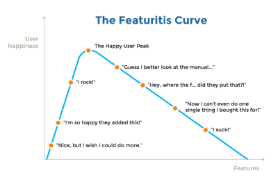
The Featuritis curve creates a correlation between user happiness and features
The Featuritis curve creates a correlation between user happiness and features. (Image credit: plutora) (Large preview)

Not all features are equally important to your users. It’s easy to see whether a particular feature works for users or not by prototyping it and testing a prototype with your users. The results of usability testing sessions will be a strong argument for meetings with stakeholders. It’s much easier to convince stakeholders when you show how users interact with a product.

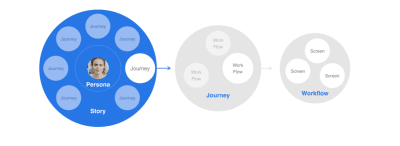
Focus on key user journeys and optimize your design for specific workflows
Focus on key user journeys and optimize your design for specific workflows. (Image credit: depalmastudios) (Large preview)

Evaluate Technical Feasibility

The cost of introducing a particular feature in a product can vary drastically based on the feature complexity. In many cases, it’s hard to evaluate the complexity of specific features just by reading a feature specification. Incorrect assumption “Developing this shouldn’t take more than a day” can result in a week or even more of development. As a result, a team postpones the time to market, which ultimately leads to financial loss.

Prototypes act as a bridge between designers and developers. Prototyping helps developers understand which aspects of your idea are difficult or impossible to implement. During high-fidelity prototyping, most of the hidden shortcomings related to UI and user interactions are exposed. This information will help you to plan your resources, time, and budget. Remember that the earlier in the process you can identify and fix fundamental problems, the less expensive it is.

Exploring the technical feasibility of VR-enabled solutions using ProtoPie.

Turn Your Idea Into Multiple Ideas

When product designers come up with good ideas, they tend to think of their ideas as fully-formed solutions that a team should embrace and build. This way of thinking is very dangerous because it narrows down the team focus on one specific path that an organization should follow. However, it only happens when a team skips the prototyping phase and goes straight to implementing a final product.

If a team starts prototyping, it completely changes the way it thinks about ideas. Since a prototype is anything but sacred, and a process of prototyping is similar to experimentation, the team is more willing to try various approaches to find the one that works the best. Even when a team starts with one idea, it can follow different routes that will ultimately lead to different outcomes. A team follows a quick build-measure-learn cycle where it validates their ideas. So, without any doubts, it’s possible to say that prototyping will guide your product design decisions.

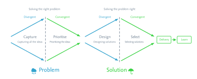
Applying the Double Diamond to discovery and ideation
Applying the Double Diamond to discovery and ideation. (Image credit: Hackernoon) (Large preview)

Don’t Stick To Your Ideas

One of the first lessons you learn in chess is ‘when you find a good move, look for a better one.’ This rule is applicable to product design. Let’s suppose you have a really good idea on your mind. The best thing you can do with it is to ignore it for a while. Take a notebook, write your idea on the piece of paper, and turn the page. Put the notebook on the shelf. This approach will help you get the idea out of your mind and keep thinking. Because you have to be willing to move on from the good ideas if you’re ever going to find the great ones.

Design With Data

“Go with your gut” is a phrase we hear throughout our lives. Each of us has our own gut feelings when making decisions, and designers often rely on personal opinions when making design decisions. Gut feelings play an essential role in developing solutions, but they are not the only tool you should be using. Influenced by gut feelings, designers can easily fall prey to misguidances, such as cognitive biases — tendencies to search for, interpret, favor, and recall information in a way that confirms or strengthens their prior personal beliefs or hypotheses.

Rather than relying solely on your intuition, collect valuable insights by testing your prototypes with real users or people who represent your target audience. It’s recommended to use high-fidelity prototypes for usability testing sessions because they’re better for soliciting feedback (when users see a realistic design, they start to evaluate it as a finished product).

How Prototypes Help Design Collaboration And Design Critique Sessions

When I started ProtoPie, I wanted to build a team that will make my ideas tangible and will create a tool for UX designers that will help them work efficiently. Now, looking back, one thing is clear: my best idea was to surround myself with a team of people who had even better ideas. Many product teams believe that the ultimate goal of product design is to create great products. But in reality, the goal is to create a judgment-free environment with highly-motivated professionals that can quickly spark creativity.

Brainstorming sessions are an essential ingredient of solid design process. During brainstorming, team members should produce as many ideas as they can to address a problem statement, evaluate the ideas, and turn the best one into prototypes.

Surround Yourself With People Who Can Openly Critique Your Work

Many large organizations suffer from the so-called HiPPO effect (highest paid person’s opinion). This effect describes the tendency for lower-paid employees to defer to higher-paid employees (usually managers) when a decision has to be made. Not to say that HiPPO effects have a significant negative impact on product design—it introduces bias into all design decisions. Whenever a team gathered together to discuss a design, instead of making a decision collaboratively, they always look at one person while sharing their ideas.

Two things will help you to deal with the HiPPO effect.

First, embrace the “There are no bad ideas” mindset. The d.School puts it in this way “It’s not about coming up with the ‘right’ idea, it’s about generating the broadest range of possibilities.” That’s why it’s important to be curious and be ready to explore various directions and prototype various solutions.

Second, honor honest feedback. Even if you’re a manager or a boss of your organization, people who work on a project should not be afraid to force you to think critically about your concepts. You should motivate your team to experiment and try various approaches. Instead of saying, “I think that this should be designed…,” you should say, “How might we design …?” This simple phrase will help you build a creative spirit and help team members solve a problem together.

Beat Personal Biases

Emotions play a massive role in the decision-making process. When we evaluate ideas, we not only try to understand the value of the concepts but also consciously or subconsciously assess the person who proposed the ideas. It is happening because often it is hard to separate the value of an idea from the person who suggests it.

Product design is all about being open-minded. It is vital to separate the value of an idea from the person who shares it. And it is easier to do that when you criticize not an idea, but a prototype. A prototype naturally makes you focus on design assets (digital or physical) rather than on the words of a person who created it. Thus, whenever team members have ideas/potential solutions, ask them to make the ideas/potential solutions tangible (create prototypes), and challenge the prototype together with other team members. Evaluate all design decisions in accordance with business goals and user needs. When testing a prototype, avoid saying, “Let’s validate this design,” but instead say,” Let’s learn what works and what doesn’t work for our users and why.” By collecting useful feedback from colleagues and other people involved in the process, you not only beat your personal bias but also find more elegant solutions for the problem.

Build-measure-learn cycle proposed by Lean Startup
Build-measure-learn cycle proposed by Lean Startup. (Image credit: openclassrooms) (Large preview)

Conclusion

Prototyping is more than just a technique that you use in product development. It is design philosophy, way of thinking. Tom and David Kelley of IDEO perfectly summed up the importance of prototyping by saying:

“If a picture is worth 1,000 words, a prototype is worth 1,000 meetings.”

Prototyping helps to formulate the main trajectory of the design by framing your mind around a continuous pursuit of better concepts. Any team that makes a prototyping integral part of their design is motivated to search for a better solution.

Smashing Editorial
(ms, ra, il)

from Tumblr https://ift.tt/3alKBCI