How To Build A Music Manager With Nuxt.js And Express.js
Deven RathoreHandling digital media assets such as audio and video in your application can be tricky because of the considerations that have to be made server-side (e.g. networking, storage and the asynchronous nature of handling file uploads). However, we can use libraries like Multer and Express.js to simplify our workflow on the backend while using Nuxt.js (Vue framework) to build out the front-end interactions.
Whenever a web client uploads a file to a server, it is generally submitted through a form and encoded as multipart/form-data. Multer is a middleware for Express.js and Node.js that makes it easy to handle this so-called multipart/form-data whenever your users upload files. In this tutorial, I will explain how you can build a music manager app by using Express.js with Multer to upload music and Nuxt.js (Vue framework) for our frontend.
Prerequisites
- Familiarity with HTML, CSS, and JavaScript (ES6+);
- Node.js, npm and MongoDB installed on your development machine;
- VS code or any code editor of your choice;
- Basic Knowledge of Express.js.
Building The Back-End Service
Let’s start by creating a directory for our project by navigating into the directory, and issuing npm init -y on your terminal to create a package.json file that manages all the dependencies for our application.
mkdir serverside && cd serverside
npm init -y
Next, install multer, express, and the other dependencies necessary to Bootstrap an Express.js app.
npm install express multer nodemon mongoose cors morgan body-parser --save
Next, create an index.js file:
touch index.js
Then, in the index.js file, we will initialize all the modules, create an Express.js app, and create a server for connecting to browsers:
const express = require("express");
const PORT = process.env.PORT || 4000;
const morgan = require("morgan");
const cors = require("cors");
const bodyParser = require("body-parser");
const mongoose = require("mongoose");
const config = require("./config/db");
const app = express();
//configure database and mongoose
mongoose.set("useCreateIndex", true);
mongoose
  .connect(config.database, { useNewUrlParser: true })
  .then(() => {
    console.log("Database is connected");
  })
  .catch(err => {
    console.log({ database_error: err });
  });
// db configuaration ends here
//registering cors
app.use(cors());
//configure body parser
app.use(bodyParser.urlencoded({ extended: false }));
app.use(bodyParser.json());
//configure body-parser ends here
app.use(morgan("dev")); // configire morgan
// define first route
app.get("/", (req, res) => {
  res.json("Hola MEVN devs...Assemble");
});
app.listen(PORT, () => {
  console.log(`App is running on ${PORT}`);
});
We, first of all, bring in Express.js into the project and then define a port that our application will be running on. Next, we bring in the body-parser, morgan ,mongoose and the cors dependencies.
We then save the express instance in a variable called app. We can use the app instance to configure middleware in our application just as we configured the cors middleware. We also use the app instance to set up the root route that will run in the port we defined.
Let’s now create a /config folder for our database config and multer config:
mkdir config and cd config
touch multer.js && touch db.js
Then open config/db.js and add the following code to configure our database:
module.exports = {
  database: "mongodb://localhost:27017/",
  secret: "password"
};
(This is actually an object that holds the database URL and the database secret.)
Running nodemon and navigating to localhost:4000 on your browser should give you this message:
"Hola MEVN devs...Assemble"
Also, this is what your terminal should now look like:

Setting Up Model, Routes, And Controllers
Let’s set up a file structure by typing in the following:
mkdir api && cd api
mkdir model && cd model && touch Music.js
cd ..
mkdir controller && cd controller && touch musicController.js
cd ..
mkdir routes && cd routes && touch music.js
In our terminal, we use mkdir to create a new directory, and then cd to move into a directory. So we start by creating a directory called api and then move into the api directory.
The touch command is used to create a new file inside a directory using the terminal, while the cd command is used to move out of a directory.
Now let’s head on over to our api/model/Music.js file to create a music schema. A model is a class with which we construct documents. In this case, each document will be a piece of music with properties and behaviors as declared in our schema:
let mongoose = require("mongoose");
let musicSchema = mongoose.Schema({
  title: {
    type: String,
    required: true
  },
  music: {
    type: Object,
    required: true
  },
  artist: {
    type: String,
    required: true
  },
  created: {
    type: Date,
    default: Date.now()
  }
});
let Music = mongoose.model("Music", musicSchema);
module.exports = Music;
Let’s head over to config/multer to configure Multer:
let multer = require("multer");
const path = require("path");
const storage = multer.diskStorage({
  destination: (req, res, cb) => {
    cb(null, "./uploads");
  },
  filename: (req, file, cb) => {
    cb(null, new Date().toISOString() + file.originalname);
  }
});
const fileFilter = (req, file, cb) => {
  if (
     file.mimetype === "audio/mpeg" ||
     file.mimetype === "audio/wave" ||
     file.mimetype === "audio/wav" ||
     file.mimetype === "audio/mp3"
  ) {
    cb(null, true);
  } else {
    cb(null, false);
  }
};
exports.upload = multer({
  storage: storage,
  limits: {
    fileSize: 1024 * 1024 * 5
  },
  fileFilter: fileFilter
});
In the multer.js file, we start by setting up a folder where all the uploaded music files will be uploaded. We need to make this file static by defining that in the index.js file:
app.use('/uploads', express.static('uploads'));
After that, we write a simple validator that will check the file mimetype before uploading. We then define the multer instance by adding the storage location, the limits of each file, and the validator that we created.
Create The Necessary Routes
Now let’s create our routes. Below is the list of endpoints we will be creating.
HTTP POST /music |
Add new music |
HTTP GET /music |
Get all music |
HTTP DELETE /music/:blogId |
Delete a music |
Let’s start by creating the blog route. Head over to api/routes/music.js and write the following code:
const express = require("express");
const router = express.Router();
const musicController = require("../controller/musicController");
const upload = require("../../config/multer");
router.get("/",  musicController.getAllMusics);
router.post("/", upload.upload.single("music"), musicController.addNewMusic);
router.delete("/:musicId", musicController.deleteMusic);
module.exports = router;
Note: Now whenever we make a get request to /music. the route calls the getAllMusic function that is located in the ‘controllers’ file.
Let’s move on over to api/controllers/musicController to define the controllers. We start by writing a function to get all the music in our database using the mongoose db.collection.find method which will return all the items in that collection.
After doing that, we write another function that will create a piece of new music in the database. We need to create a new music instance using the new keyword and then define the music object. After doing this, we will use the mongoose save method to add new music to the database.
In order to delete a piece of music, we need to use the mongoose remove method by simply passing the music ID as a parameter in the remove instance. This results to mongoose looking into the music collection that has that particular ID and then removing it from that collection.
let mongoose = require("mongoose");
const Music = require("../model/Music");
exports.getAllMusics = async (req, res) => {
  try {
    let music = await Music.find();
    res.status(200).json(music);
  } catch (err) {
    res.status(500).json(err);
  }
};
exports.addNewMusic = async (req, res) => {
  try {
    const music = new Music({
      title:req.body.title,
      artist:req.body.artist,
      music:req.file
    });

    let newMusic = await music.save();
    res.status(200).json({ data: newMusic });
  } catch (err) {
    res.status(500).json({ error: err });
  }
};
exports.deleteMusic = async (req, res) => {
  try {
    const id = req.params.musicId;
    let result = await Music.remove({ _id: id });
    res.status(200).json(result);
  } catch (err) {
    res.status(500).json(err);
  }
};
Last but not least, in order to test the routes, we need to register the music routes in our index.js file:
const userRoutes = require("./api/user/route/user"); //bring in our user routes
app.use("/user", userRoutes);
Testing The End Points
To test our endpoints, we will be using POSTMAN.
Adding New Music
To test the Add Music functionality, set the method of the request by clicking on the methods drop-down. After doing this, type the URL of the endpoint and then click on the body tab to select how you want to send your data. (In our case, we will be using the form-data method.)
So click on the form-data and set up your model key. As you set it up, give the keys some value as shown in the image below:

After doing this, click on ‘Send’ to make the request.
Listing All Music
To list all of the music in our database, we have to type the endpoint URL in the URL section provided. After doing this, click on the ‘Send’ button to make the request.

Deleting Music
To delete a piece of music, we need to pass the music id as a parameter.

That’s it!
Building The Frontend
For our frontend, we will be using a Vue framework: Nuxt.js.
“Nuxt is a progressive framework based on Vue.js to create modern web applications. It is based on Vue.js official libraries (vue, vue-router and vuex) and powerful development tools (webpack, Babel and PostCSS).”
— NuxtJS Guide
To create a new Nuxt.js application, open up your terminal and type in the following (with musicapp as the name of the app we will be building):
$ npx create-nuxt-app musicapp
During the installation process, we will be asked some questions regarding the project setup:
Project name |
musicapp |
project description |
A Simple music manager app |
Author name |
<your name> |
Package manager |
npm |
UI framework |
Bootstrap vue |
custom ui framework |
none |
Nuxt modules |
Axios,pwa (use the spacebar on your keyboard to select items) |
Linting tool |
Prettier |
test framework |
None |
Rendering Mode |
Universal (SSR) |
development tool |
Jsonconfig.json |
After selecting all of this, we have to wait a little while for the project to be set up. Once it’s ready, move into the /project folder and serve the project as follows:
cd musicapp && npm run dev
Open up the project in any code editor of your choice and then open the project in the browser by accessing localhost:3000.

Configuring Axios
We will be using axios to make an HTTP request to our back-end server. Axios is already installed in our project, so we just have to configure the baseURL- to our backend server.
To do this, open the nuxt.config.js file in the root directory and add the baseURL in the axios object.
axios: {
  baseURL:'http://localhost:4000'
},
Building The Music Manager
Setting Up The UI
Let’s start by cleaning up the UI. Open up the pages/index.vue file and remove all of the code in there with the following:
<template>
<div>Hello</div>
</template>
After doing this, you should only be able to see a “Hello” in the browser.
In the root directory, create a /partials folder. Inside the /partials folder, create a navbar.vue file and add the following code:
<template>
  <header>
    <nav class="navbar navbar-expand-lg navbar-light bg-info">
      <div class="container">
        <a class="navbar-brand" href="#">Music App</a>
        <button
          class="navbar-toggler"
          type="button"
          data-toggle="collapse"
          data-target="#navbarNav"
          aria-controls="navbarNav"
          aria-expanded="false"
          aria-label="Toggle navigation"
        >
          <span class="navbar-toggler-icon"></span>
        </button>
        <div class="collapse navbar-collapse justify-content-end" id="navbarNav">
          <ul class="navbar-nav">
            <li class="nav-item active">
              <a class="nav-link" href="#">Player</a>
            </li>
            <li class="nav-item">
              <a class="nav-link" href="#">Manager</a>
            </li>
          </ul>
        </div>
      </div>
    </nav>
  </header>
</template>
<style scoped>
.nav-link,
.navbar-brand {
  color: #ffff !important;
}
</style>
Note: We will be using the component to navigate through pages in our application. This is just going to be a simple component made up of Bootstrap navbar. Check out the official Bootstrap documentation for more reference.
Next, let’s define a custom layout for the application. Open the /layouts folder, replace the code in the default.vue file with the code below.
<template>
  <div>
    <navbar />
    <nuxt />
  </div>
</template>
<script>
import navbar from '@/partial/navbar'
export default {
  components: {
    navbar
  }
}
</script>
We import the navbar into this layout, meaning that all the pages in our application will have that navbar component in it. (This is going to be the component that all other component in our application will be mounted.)
After this, you should be able to see this in your browser:

Now let’s setup the UI for our manager. To do this, we need to create a /manager folder within the components folder and then add a file into the folder named manager.vue.
In this file, add the following code:
<template>
  <section class="mt-5">
    <div class="container mb-4">
      <div class="row">
        <div class="col-md-12">
          <div class="card">
            <div class="card-body">
              <div class="card-title mb-4">
                <h4>Add Music</h4>
              </div>
              <form>
                <div class="form-group">
                  <label for="title">Title</label>
                  <input type="text" class="form-control" />
                </div>
                <div class="form-group">
                  <label for="artist">Artist</label>
                  <input type="text" class="form-control" />
                </div>
                <div class="form-group">
                  <label for="artist">Music</label>
                  <div class="custom-file">
                    <input type="file" class="custom-file-input" id="customFile" />
                    <label class="custom-file-label" for="customFile">Choose file</label>
                  </div>
                </div>
                <div class="form-group">
                  <button class="btn btn-primary">Submit</button>
                </div>
              </form>
            </div>
          </div>
        </div>
      </div>
    </div>
    <div class="container">
      <div class="row">
        <div class="col-md-12">
          <div class="card bg-light p-1 showdow-sm">
            <div class="card-title">
              <button class="btn btn-info m-3">Add Music</button>
            </div>
            <div class="card-body">
              <table class="table">
                <thead>
                  <tr>
                    <th scope="col">#</th>
                    <th scope="col">Title</th>
                    <th scope="col">Artist</th>
                    <th scope="col">Date created</th>
                    <th scope="col">Action</th>
                  </tr>
                </thead>
                <tbody>
                  <tr>
                    <td>1</td>
                    <td>Demo Title</td>
                    <td>Wisdom.vue</td>
                    <td>12/23/13</td>
                    <td>
                      <button class="btn btn-info">Delete</button>
                    </td>
                  </tr>
                </tbody>
              </table>
            </div>
          </div>
        </div>
      </div>
    </div>
  </section>
</template>
Note: This is just a simple Bootstrap template for adding music into our application. The form will define a table template that will list all os the music that can be found in our database.
After defining this component, we need to register it in the /pages folder to initailize routing.
Nuxt.js doesn’t have a ‘router.js’ file like Vue.js. It uses the pages folder for routing. For more details, visit the Nuxt.js website.
To register the component, create a /manager folder within the /pages folder and create an index.vue file. Then, place the following code inside the file:
<template>
  <div>
    <manager />
  </div>
</template>
<script>
import manager from '@/components/manager/manager'
export default {
  components: {
    manager
  }
}
</script>
This is the component that will render in our pages route.
After doing this, head over to your browser and navigate to /manager — you should be seeing this:

Listing All Music
Let’s continue by creating a function that will fetch all of the music. This function will be registered in the created life cycle hook, so that whenever the component is created, the function will be called.
Let’s start by creating a variable in the vue instance that will hold all of the music:
allmusic = [];
musicLoading: false,
Then, define a getAllMusics function and add the following code:
async getAllMusics() {
    this.musicLoading = true
    try {
      let data = await this.$axios.$get('/music')
      this.allmusic = data
      this.musicLoading = false
    } catch (err) {
      this.musicLoading = false
      swal('Error', 'Error Fetting Musics', 'error')
    }
  }
Next, register within the created life cycle hook:
created() {
    this.getAllMusics()
  }
Outputting The Data
Now it’s time to output all of the songs on the table which we’ve created earlier:
<table class="table">
              <thead>
                <tr>
                  <th scope="col">#</th>
                  <th scope="col">Title</th>
                  <th scope="col">Artist</th>
                  <th scope="col">Date created</th>
                  <th scope="col">Action</th>
                </tr>
              </thead>
              <div
                v-if="musicLoading"
                class="spinner-border"
                style="width: 3rem; height: 3rem;"
                role="status"
              >
                <span class="sr-only">Loading...</span>
              </div>
              <tbody v-else>
                <tr v-for="(music, index) in allmusic" :key="index">
                  <td></td>
                  <td></td>
                  <td></td>
                  <td></td>
                  <td>
                    <button class="btn btn-info" @click="deleteMusic(music._id)">Delete</button>
                  </td>
                </tr>
              </tbody>
            </table>
Remember that table we created earlier? Well, we will need to loop through the response we get back from our backend to list all of the music received back from the database.
Adding Music
To add a new piece of music we need to make an HTTP request to the back-end server with the music details. To do this, let’s start by modifying the form and handling of the file uploads.
On the form, we need to add an event listener that will listen to the form when it is submitted. On the input field, we add a v- model to bind the value to the input field.
<form @submit.prevent="addNewMusic">
            <div class="form-group">
              <label for="title">Title</label>
              <input type="text" v-model="musicDetails.title" class="form-control" />
            </div>
            <div class="form-group">
              <label for="artist">Artist</label>
              <input type="text" v-model="musicDetails.artist" class="form-control" />
            </div>
            <div class="form-group">
              <label for="artist">Music</label>
              <div class="custom-file">
                <input
                  type="file"
                  id="customFile"
                  ref="file"
                  v-on:change="handleFileUpload()"
                  class="custom-file-input"
                />
                <label class="custom-file-label" for="customFile">Choose file</label>
              </div>
            </div>
            <div class="form-group">
               <button class="btn btn-primary" :disabled="isDisabled">
                <span
                  class="spinner-border spinner-border-sm"
                  v-if="addLoading"
                  role="status"
                  aria-hidden="true"
                ></span>Submit
              </button>
            </div>
          </form>
And the script section should look like this:
<script>
export default {
  data() {
    return {
      musicDetails: {
        title: '',
        artist: '',
        music: ''
      },
      allmusic = [],
        musicLoading: false,
      isValid: false;
      addLoading: false,
    }
  },
  computed: {
    isDisabled: function() {
      if (
        this.musicDetails.title === '' ||
        this.musicDetails.artist === '' ||
        this.musicDetails.music === ''
      ) {
        return !this.isValid
      }
    }
  },
  methods: {
    handleFileUpload() {
      this.musicDetails.music = this.$refs.file.files[0]
      console.log(this.musicDetails.music.type)
    },
    addNewMusic() {
      let types = /(\.|\/)(mp3|mp4)$/i
      if (
        types.test(this.musicDetails.music.type) ||
        types.test(this.musicDetails.music.name)
      ) {
        console.log('erjkb')
      } else {
        alert('Invalid file type')
        return !this.isValid
      }
    }
  }
}
</script>
We will define a function that will send a request to our back-end service to create any new music that has been added to the list. Also. we need to write a simple validation function that will check for the file type so that the users can only upload files with an extention of .mp3 and .mp4.
It’s important to define a computed property to make sure that our input field isn’t empty. We also need to add a simple validator that will make sure the the file we are trying to upload is actually a music file.
Let’s continue by editing the addMusic function to make a request to our back-end service. But before we do this, let’s first install sweetalert which will provide us with a nice modal window. To do this this, open up your terminal and type in the following:
npm i sweetalert
After installing the package, create a sweetalert.js file in the /plugins folder and add this:
import Vue from 'vue';
import swal from 'sweetalert';

Vue.prototype.$swal = swal;
Then, register the plugin in the nuxt.config.js file inside the plugin instace like this:
plugins: [
    {
      src: '~/plugins/sweetalert'
    }
  ],
We have now successfully configured sweetalert in our application, so we can move on and edit the addmusic function to this:
addNewMusic() {
    let types = /(\.|\/)(mp3|mp4)$/i
    if (
      types.test(this.musicDetails.music.type) ||
      types.test(this.musicDetails.music.name)
    ) {
      let formData = new FormData()
      formData.append('title', this.musicDetails.title)
      formData.append('artist', this.musicDetails.artist)
      formData.append('music', this.musicDetails.music)
      this.addLoading = true
      this.$axios
        .$post('/music', formData)
        .then(response => {
          console.log(response)
          this.addLoading = false
          this.musicDetails = {}
          this.getAllMusics() // we will create this function later
          swal('Success', 'New Music Added', 'success')
        })
        .catch(err => {
          this.addLoading = false
          swal('Error', 'Something Went wrong', 'error')
          console.log(err)
        })
    } else {
      swal('Error', 'Invalid file type', 'error')
      return !this.isValid
    }
  },
Let’s write a simple script that will toggle the form, i.e it should only display when we want to add new music.
We can do this by editing the ‘Add Music’ button in the table that displays all of the music that can be found:
<button
    class="btn btn-info m-3"
    @click="initForm">

</button>
Then, add a state that will hold the state of the form in the data property:
addState: false
After doing this, let’s define the initForm function:
initForm() {
    this.addState = !this.addState
  },
And then add v-if="addState" to the div that holds the form:
<div class="card" v-if="addState">
Deleting Music
To delete music, we need to call the delete endpoint and pass the music id as a param. Let’s add a click event to the ‘Delete’ button that will trigger the function to delete a function:
<button class="btn btn-info" @click="deleteMusic(music._id)">Delete</button>
The delete function will be making an HTTP request to our back-end service. After getting the music ID from the deleteMusic function parameter, we will add the ID in the URL that we are using to send the request. This specifies the exact piece of music that ought to be removed from the database.
deleteMusic(id) {
    swal({
      title: 'Are you sure?',
      text: 'Once deleted, you will not be able to recover this Music!',
      icon: 'warning',
      buttons: true,
      dangerMode: true
    }).then(willDelete => {
      if (willDelete) {
        this.$axios
          .$delete('/music/' + id)
          .then(response => {
            this.getAllMusics()
            swal('Poof! Your Music file has been deleted!', {
              icon: 'success'
            })
          })
          .catch(err => {
            swal('Error', 'Somethimg went wrong', 'error')
          })
      } else {
        swal('Your Music file is safe!')
      }
    })
  }
With all of this, we have just built our music manager. Now it’s time to build the music player.
Let’s start by creating a new folder in the components folder named /player. Then, create a player.vue file within this folder and add this:
<template>
  <section>
    <div class="container">
      <div class="row">
        <div class="col-md-12">
          <h3 class="text-center">Player</h3>
        </div>
      </div>
    </div>
  </section>
</template>
<script>
export default {
  data() {
    return {}
  }
}
</script>
<style  scoped>
</style>
Next, let’s import this component into the index.vue file in the /pages folder. Replace the code in index.vue file to this:
<template>
  <div>
    <player />
  </div>
</template>
<script>
import player from '@/components/player/player'
export default {
  components: {
    player
  }
}
</script>
Let’s configure routing in our navbar component to enable routing between our pages.
To route in a Nuxt.js application, the nuxt-link is used after which you have specified the page for that route to a particular instance. So let’s edit the code in the partials/navbar component to this:
<template>
  <header>
    <nav class="navbar navbar-expand-lg navbar-light bg-info">
      <div class="container">
        <nuxt-link to="/" class="navbar-brand">Music App</nuxt-link>
        <button
          class="navbar-toggler"
          type="button"
          data-toggle="collapse"
          data-target="#navbarNav"
          aria-controls="navbarNav"
          aria-expanded="false"
          aria-label="Toggle navigation"
        >
          <span class="navbar-toggler-icon"></span>
        </button>
        <div class="collapse navbar-collapse justify-content-end" id="navbarNav">
          <ul class="navbar-nav">
            <li class="nav-item active">
              <nuxt-link to="/" class="nav-link">Player</nuxt-link>
            </li>
            <li class="nav-item">
              <nuxt-link to="/manager" class="nav-link">Manager</nuxt-link>
            </li>
          </ul>
        </div>
      </div>
    </nav>
  </header>
</template>
<style scoped>
.nav-link,
.navbar-brand {
  color: #ffff !important;
}
</style>
With this, we can navigate through our pages by using the navbar.
Building The Player
Before we begin, we need to extend Webpack to load audio files. Audio files should be processed by file-loader. This loader is already included in the default Webpack configuration, but it is not set up to handle audio files.
To do this, go to the nuxt.config.js file and modify the build object to this:
build: {
    extend(config, ctx) {
      config.module.rules.push({
        test: /\.(ogg|mp3|mp4|wav|mpe?g)$/i,
        loader: 'file-loader',
        options: {
          name: '\[path\][name].[ext]'
        }
      })
    }
  }
Next, let’s write a function that will get all songs and then use the Audio constructor to play the first song in the allMusic array.
For starters, let’s modify our player.vue file to this:
<template>
  <section v-if="allMusic">
    <div class="container">
      <div class="row">
        <div class="col-md-12">
          <h3 class="text-center">Player</h3>
        </div>
      </div>
      <div class="row">
        <div class="col-md-6">
          <span> - </span>
        </div>
      </div>
    </div>
  </section>
</template>
<script>
export default {
  data() {
    return {
      current: {
        title: '',
        artist: ''
      },
      song: true,
      isplaying: false,
      allMusic: null,
      index: 0,
      player: ''
    }
  },
  methods: {
     async initPlayer() {
      if (this.allMusic !== []) {
        this.current = await this.allMusic[this.index]
        this.player.src = `http://localhost:4000/${this.current.music.path}`
      } else {
        this.song = true
      }
    },
      async getAllSongs() {
        try {
        let response = await this.$axios.$get('/music')
        console.log(response)
        if (response === []) {
          this.song = true
          this.current = null
        } else {
          this.song = false
          this.allMusic = response
        }
        await this.initPlayer()
      } catch (err) {
        this.current = null
        console.log(err)
      }
    }
  },
  created() {
 if (process.client) {
      this.player = new Audio()
    }
    this.getAllSongs()
  }
}
</script>
<style  scoped>
</style>
Once the file is served, the music will play in the background and then you should be able to see this in your browser:
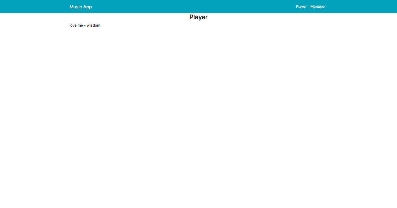
To stop the music, all you need to do is comment out the await player.play() in the initPlayer function.
Creating The Player UI
Let’s now define our music player UI by replacing the template in our player.vue file with the following:
<template>
  <section v-if="allMusic">
    <div class="container">
      <div class="row mb-5">
        <div class="col-md-12">
          <h3 class="text-center">Player</h3>
        </div>
      </div>
      <div class="row mt-5">
        <div class="col-md-6">
          <img
            src="https://images.pexels.com/photos/3624281/pexels-photo-3624281.jpeg?auto=compress&cs=tinysrgb&dpr=1&w=500"
            class="image"
          />
          <div class="card player_card">
            <div class="card-body">
              <h6 class="card-title">
                <b> - </b>
              </h6>
              <div>
                <i class="fas fa-backward control mr-4"></i>
                <i class="fas fa-play play"></i>
                <i class="fas fa-pause play"></i>
                <i class="fas fa-forward control ml-4"></i>
              </div>
            </div>
          </div>
        </div>
        <div class="col-md-6">
          <div class="card shadow">
            <table class="table">
              <thead>
                <tr>
                  <th scope="col">#</th>
                  <th scope="col">Title</th>
                  <th scope="col">Artist</th>
                  <th scope="col">Action</th>
                </tr>
              </thead>
              <tbody>
                <tr>
                  <th scope="row">1</th>
                  <td>Mark</td>
                  <td>Otto</td>
                  <td>
                    <button class="btn btn-primary">Play</button>
                  </td>
                </tr>
              </tbody>
            </table>
          </div>
        </div>
      </div>
    </div>
  </section>
</template>
Then, add the following style into the style section:
<style  scoped>
.image {
  border-radius: 5px !important;
  position: relative;
  height: 300px;
  width: 100%;
}
.player_card {
  text-align: center;
  bottom: 20px;
  margin: 0px 40px;
}
.text-muted {
  font-size: 15px;
}
.play {
  font-size: 40px;
}
.control {
  font-size: 25px;
}
</style>
After modifying this, the player should look like this:

Adding The Play Function
We’ll continue by displaying the music description on the table. In order to do this, replace the table with the code below:
<table class="table">
              <thead>
                <tr>
                  <th scope="col">#</th>
                  <th scope="col">Title</th>
                  <th scope="col">Artist</th>
                  <th scope="col">Action</th>
                </tr>
              </thead>
              <tbody>
                <tr v-for="(music,index) in allMusic" :key="index">
                  <th scope="row"></th>
                  <td></td>
                  <td></td>
                  <td>
                    <button class="btn btn-primary">Play</button>
                  </td>
                </tr>
              </tbody>
            </table>
We don’t want to display the ‘Play’ and ‘Pause’ icons at the same time. Instead, we want a situation that when the song is playing, the ‘Pause’ icon is displayed. Also, when the song is paused, the play icon should be displayed.
To achieve this, we need to set a isPlaying state to the false instance and then use this instance to toggle the icons. After that, we will add a function to our ‘Play’ icon.
isplaying:false
After doing this, modify your ‘Play’ and ‘Pause’ icon to this:
<i class="fas fa-play play" v-if="!isplaying" @click="play"></i>
<i class="fas fa-pause play" v-else></i>
With all this let’s define the play method:
play(song) {
      console.log(song)
      if (song) {
        this.current = song
        this.player.src = `http://localhost:4000/${this.current.music.path}`
      }
      this.player.play()
      this.isplaying = true
    },
We, first of all, get the current song and pass it into the function parameter. We then define the JavaScript Audio() instance. Next, we check if the song is null: If it isn’t, we set this.current to the song we passed in the parameter, and then we call the Audio player instance. (Also, don’t forget that we have to set the isPlaying state to true when the music is playing.)
Adding The Pause Function
To pause a song, we will use the Audio pause method. We need to add a click event to the pause icon:
<i class="fas fa-pause play" @click="pause" v-else></i>
And then define the function in the methods instance:
pause() {
      this.player.pause()
      this.isplaying = false
    },
Playing A Song From The Music List
This is quite simple to implement. All we have to do is add a click event that will change the song parameter in the play method to the song we just created.
Simply modify the play button on the music list table to this:
<button class="btn btn-primary" @click="play(music)">Play</button>
And there you have it!
Adding The Next Function
To add the next function, we need to increment the index by one. To do this, add a click event to the next icon:
@click="next"
And then define the prev function in the methods instance:
next() {
      this.index++
      if (this.index > this.allMusic.length - 1) {
        this.index = 0
      }
       this.current = this.allMusic[this.index]
      this.play(this.current)
    },
This conditional is responsible for replaying all of the songs whenever the last song in the list has been played.
Adding The previous Function
This is actually the opposite of the next function, so let’s add a click event to the previous function:
@click="prev"
Next, we define the previous function:
prev() {
      this.index--
      if (this.index
Our music player app is now complete!
Conclusion
In this article, we looked at how we can build a music manager with Nuxt.js and Express.js. Along the way, we saw how Multer streamlines the process of handling file uploads and how to use Mongoose to interact without a database. Finally, we used Nuxt.js to build the client app which gives it a fast and snappy feel.
Unlike other frameworks, building an application with Nuxt.js and Express.js is quite easy and fast. The cool part about Nuxt.js is the way it manages your routes and makes you structure your apps better.

from Tumblr https://ift.tt/2Pw9NP3